What is VeedoAI
VeedoAI is an AI video understanding platform for legal, education, and enterprise teams. As the sole designer on a four-person founding team, I designed four product surfaces and the component library behind them, and the product went from zero to 7,000+ users in four months.
The hard part wasn't the interface. It was designing trust into a system that is right most — not all — of the time.
What the design delivered — and how each number was produced
Every figure on this page carries its provenance. I'd rather show you a smaller honest number than a bigger unattributable one.
In a $7.2B market, design was the only wedge a four-person team had
Every incumbent solved one slice: Twelve Labs had search without collaboration, AnyClip monetization without summarization, Gemini tagging without multimodal interaction. We could not out-model any of them.



That changed what my job was. I wasn't designing screens for an AI product. I was designing the company's differentiation — which meant every decision below is also a decision about where a team with no resources chooses to compete.
The brief was "make video searchable." That was the wrong problem
27 interviews with legal analysts, training managers, and content strategists showed the brief was aimed one layer too shallow. Legal and training participants said the same thing in different words: one wrong summary and they would stop using the tool.
Users weren't failing to find things. They were failing to trust what they found.
So I changed what we were building: not a search tool with good AI, but a comprehension tool that is honest about being probabilistic. Search accuracy wasn't the product problem. Verifiability was.
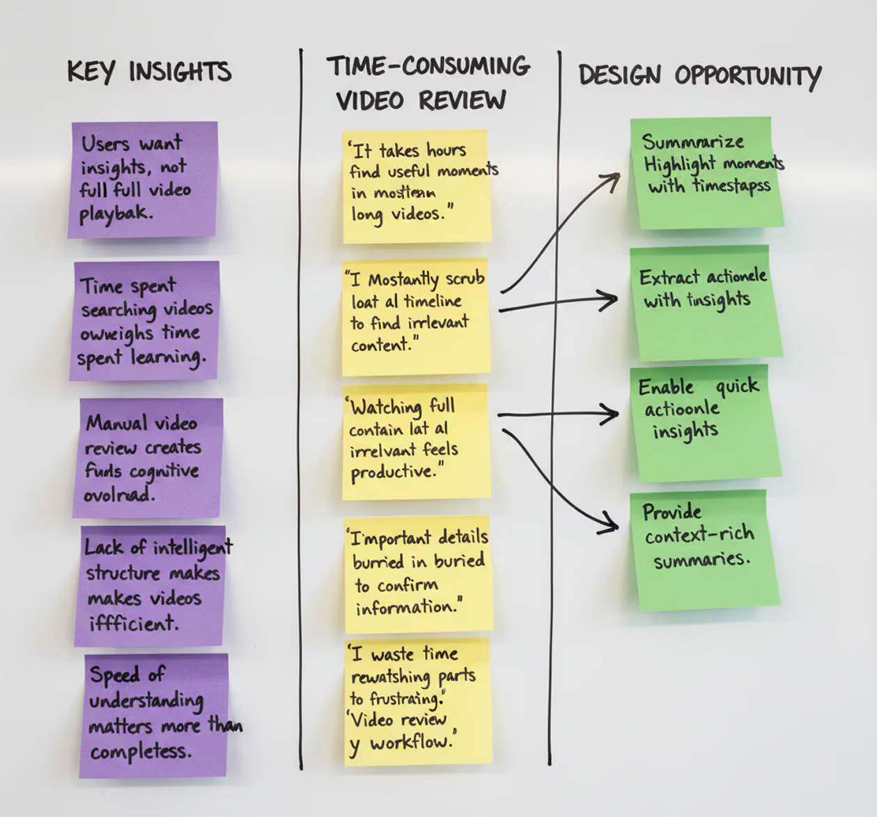
Three segments, one complaint, three different design answers
27 interviews. Each segment described the same problem in its own vocabulary — and each needed a different thing built.

🎓 Educators

⚖️ Legal Teams

🎥 Creators
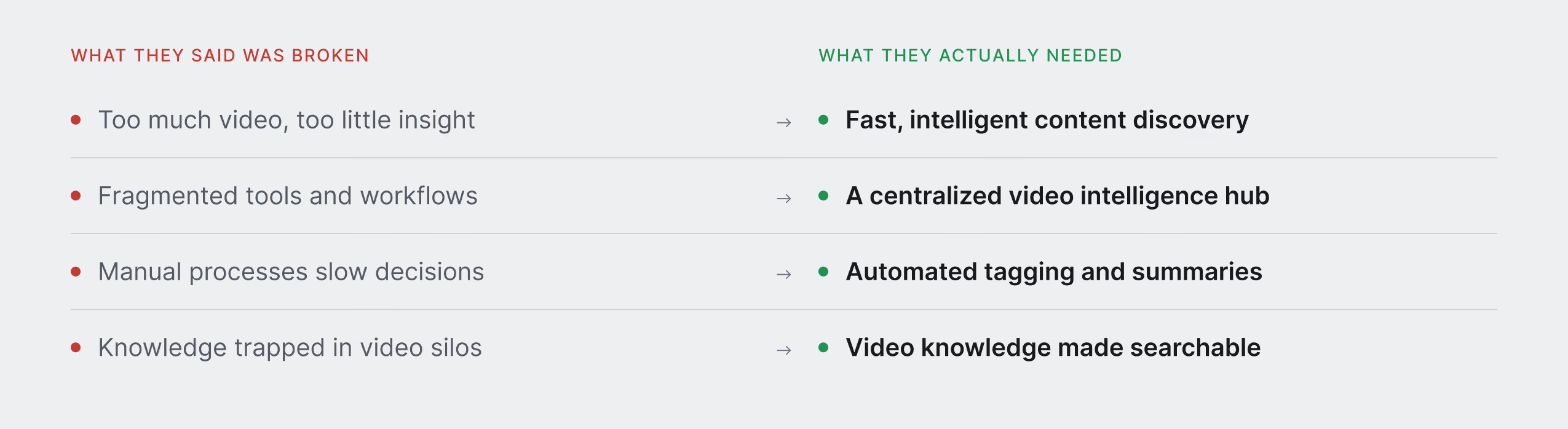
The synthesis that moved the brief. Read the right column: every stated need is about acting on what the video contains, not locating it. That asymmetry is what told me the problem was one layer deeper than search.
Nobody could tell me what the problem cost, or what success would look like
Before I could design, I had to build both numbers myself.
The size of the wound
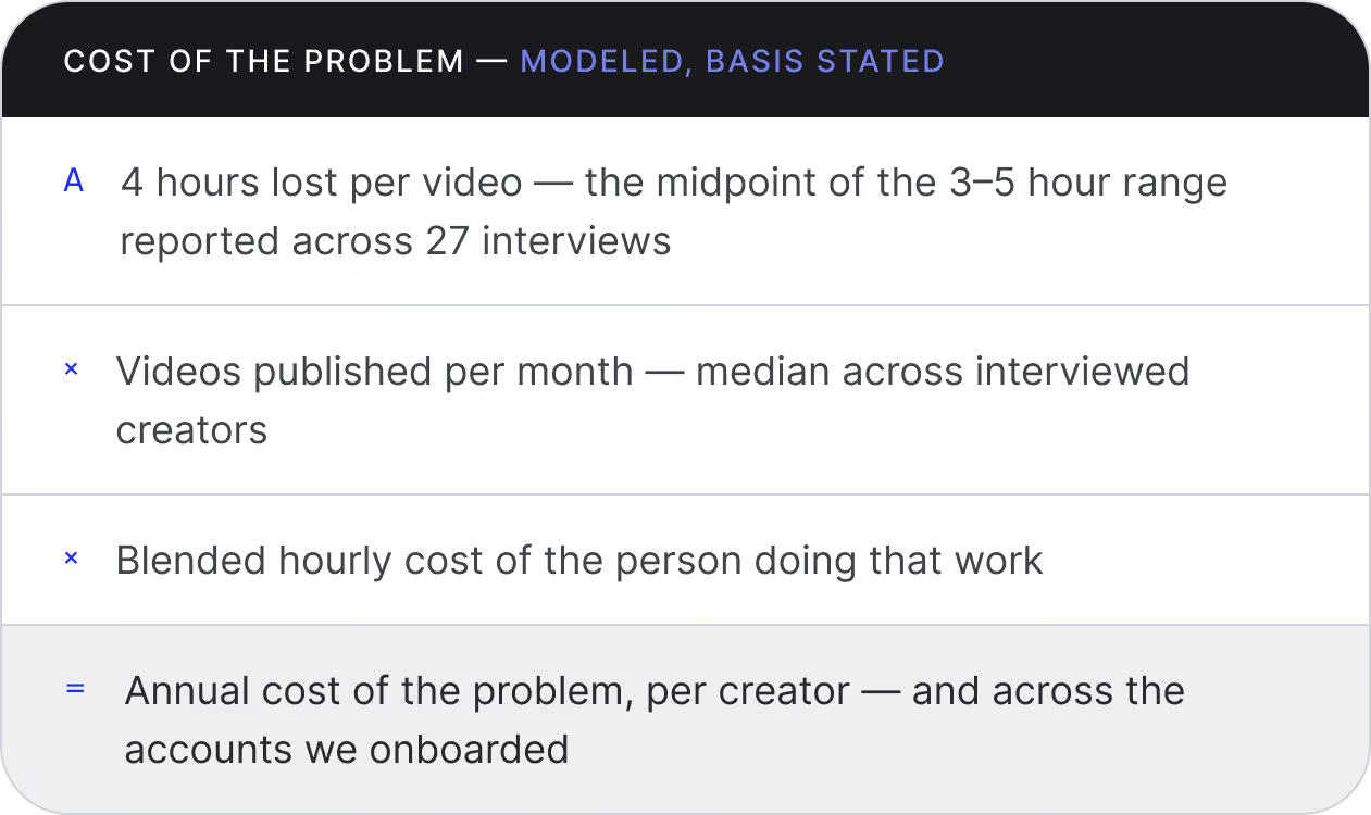
A $7.2B market is not a design brief. Across 27 interviews one figure kept recurring: 3–5 hours per video lost to search and distribution alone. Nobody had multiplied it out. I did.
The model gave the founders a number to price against, told me which segment to design for first, and reframed the product from a convenience into cost recovery. It sizes the wound, not the cure.
A summary that saves you four hours and is wrong once costs more than the four hours it saved.
Retrieval was solved. Verification was not. That gap was the entire opportunity — and it was a design problem, not a model problem, which is the only kind a four-person team could win.
There was no metric for "the AI understood this"
The only proxy anyone used was task completion — did the user find the thing. That measures retrieval, not whether the user believed what they found, which was the actual failure mode. So I modeled comprehension health across three dimensions and proposed them as the product's success criteria.
Verification rate is not a metric you maximize. Push it to zero and users are trusting blindly — for a legal analyst, a liability. Push it toward one and the AI has saved nobody any time. There's a healthy band in the middle, and where it sits depends on the stakes of the job.
So I wasn't designing to make people trust the AI more. I was designing to make trust proportional to stakes — heavier verification affordances for the legal analyst, lighter for the creator cutting a short. Same model, different trust posture per segment.
Four surfaces, one loop: ask, answer, verify
Ask a question against footage. Get an answer. Verify it against the second it came from.
Ask → Answer → Verify
One interaction connecting search, AI summaries, source moments, and recommendations across four surfaces.
Four surfaces, one loop: ask, answer, verify
Ask a question against footage. Get an answer. Verify it against the second it came from.
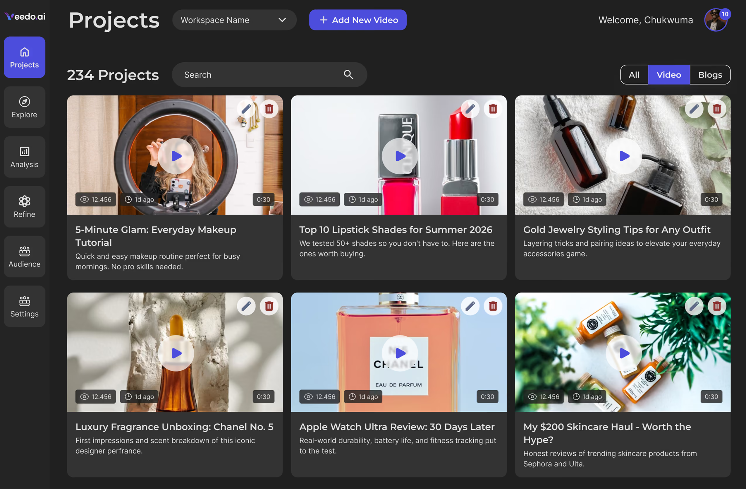
Comprehension starts before you open anything
Every project carries its summary at the list level — the first place "extract, don't watch" shows up, and the reason this isn't a file browser.
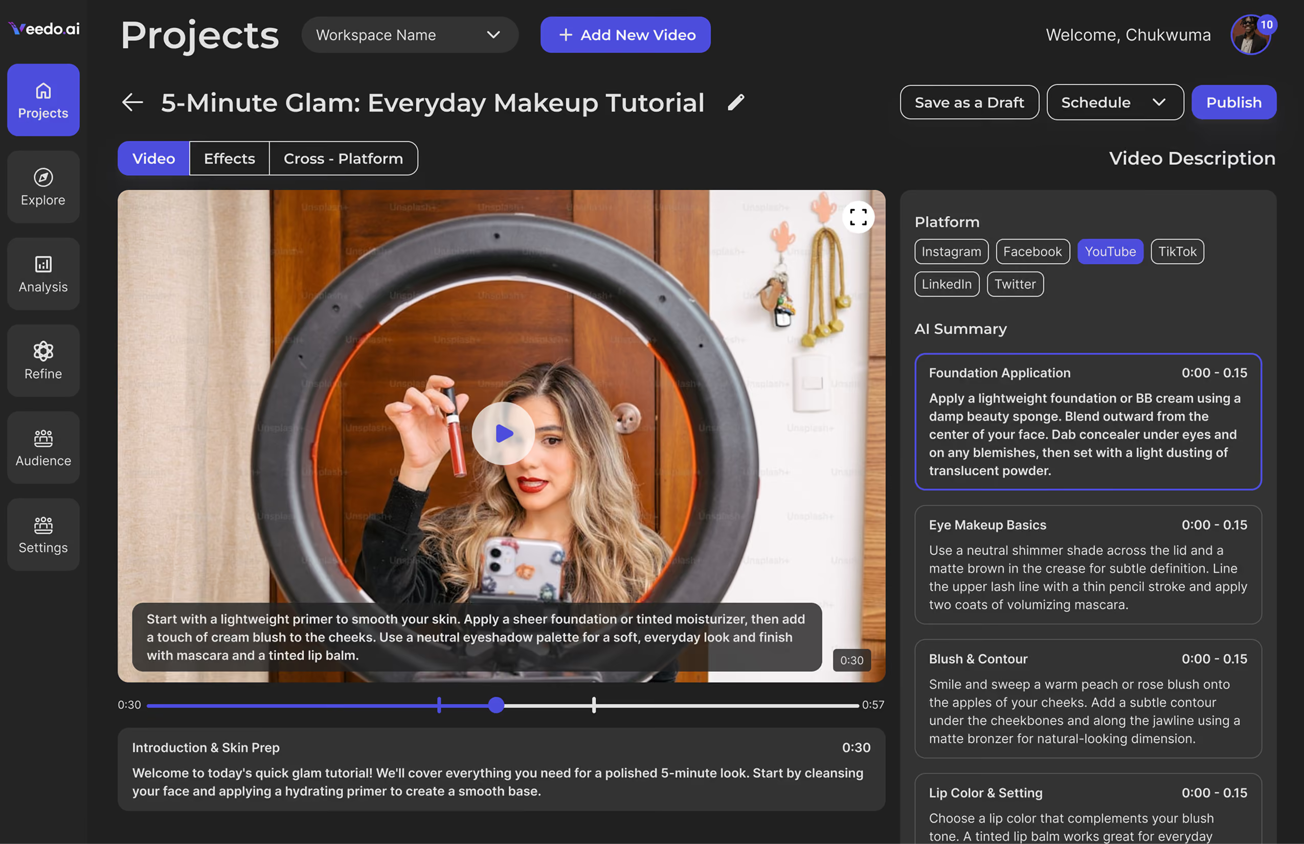
The summary and its source never separate
Recaps generate from the timeline, not a detached transcript — so verification stays one click away at the point where a wrong claim would get baked into a shared clip.
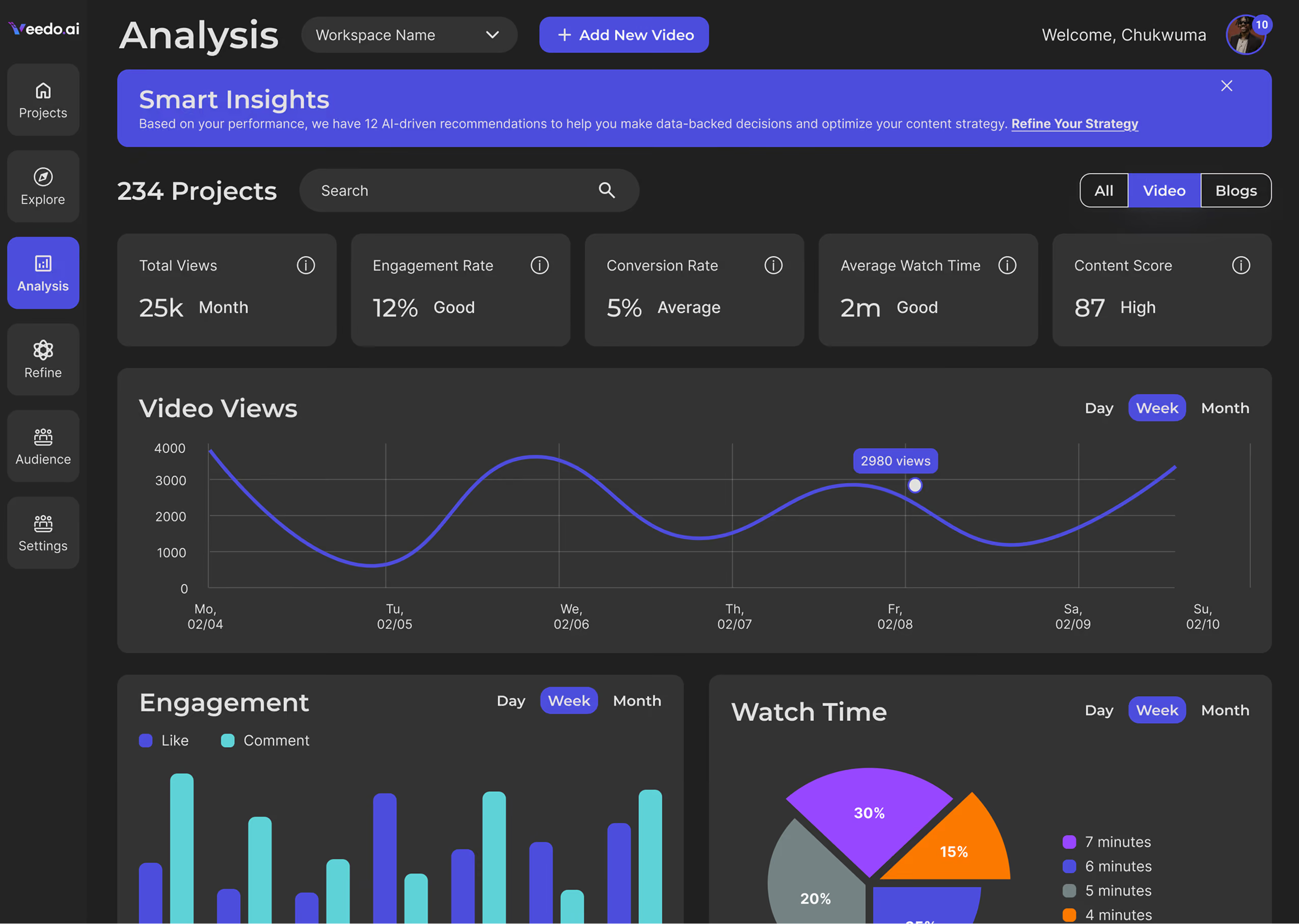
Where attention actually went
The evidence layer under Surface 04. Without it, Refine would be the AI having opinions — the thing the rest of the product argues against.
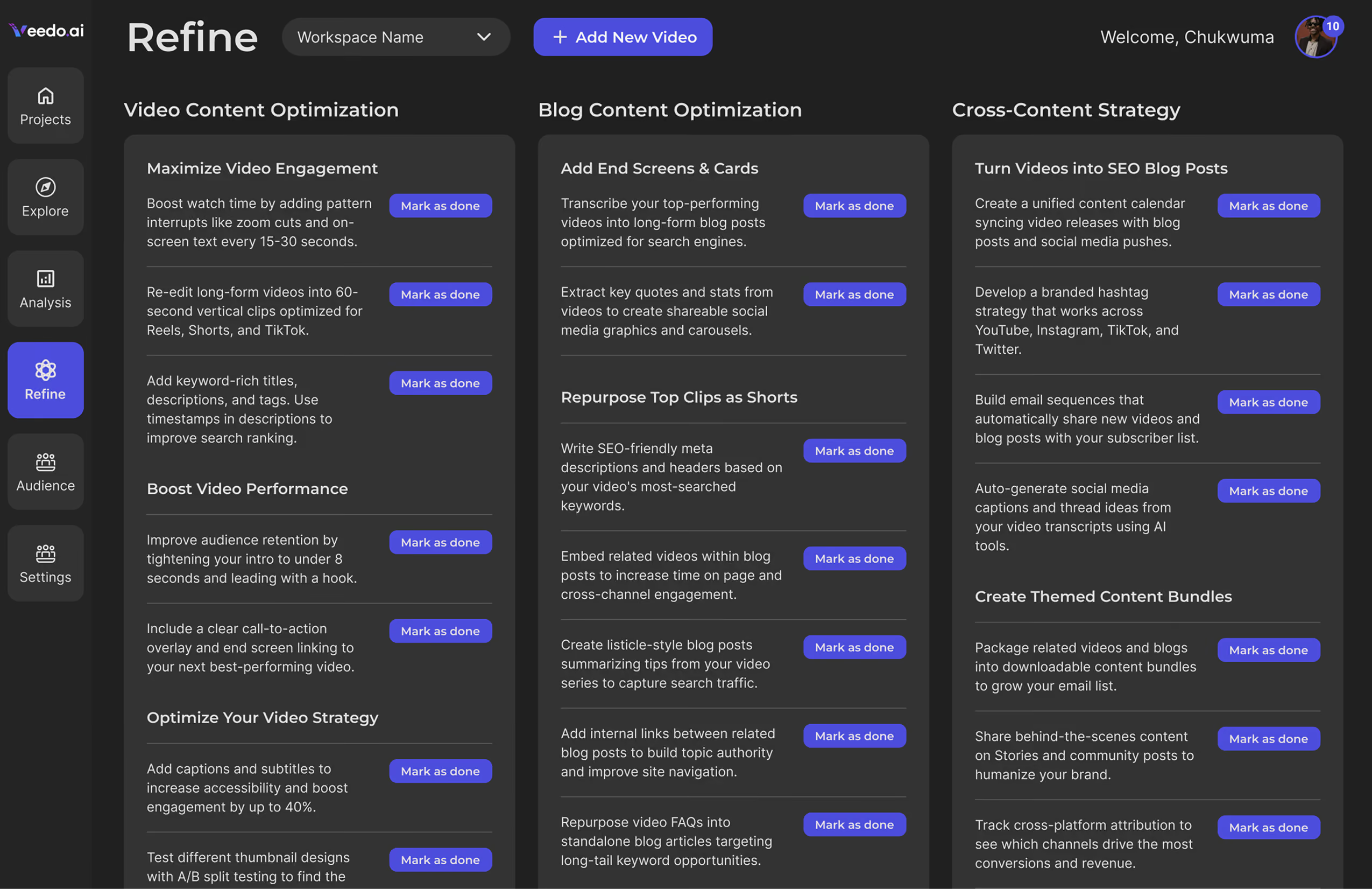
Advice carries its evidence too
Every suggestion links back to the behaviour that produced it — the verification rule applied to recommendations. One principle, four surfaces.
The live prototype
Start at the summary. Click any source chip to jump to the moment it came from. That round trip is the product, everything else on this page is an argument for it.
Open full screen in Figma ↗The wireframes that led to the architecture call
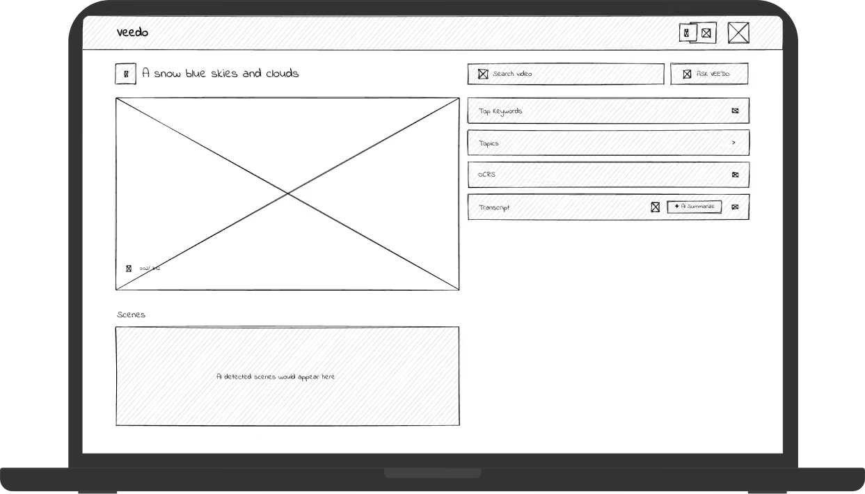
Same screen, same chrome — one structural element changed. The captions record what each version taught, not what it looks like.
Before
After
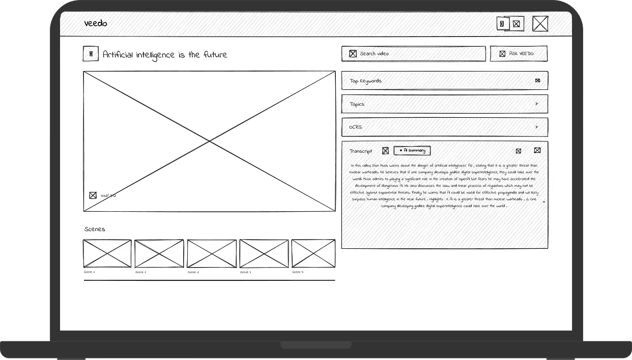
↓ These wireframes became Decision 01 below — where the same choice is shown in final production UI, and the cost of making it is named.
Three calls, the options I rejected, and what each one cost
Same screen, same chrome — one structural element changed. The captions record what each version taught, not what it looks like.
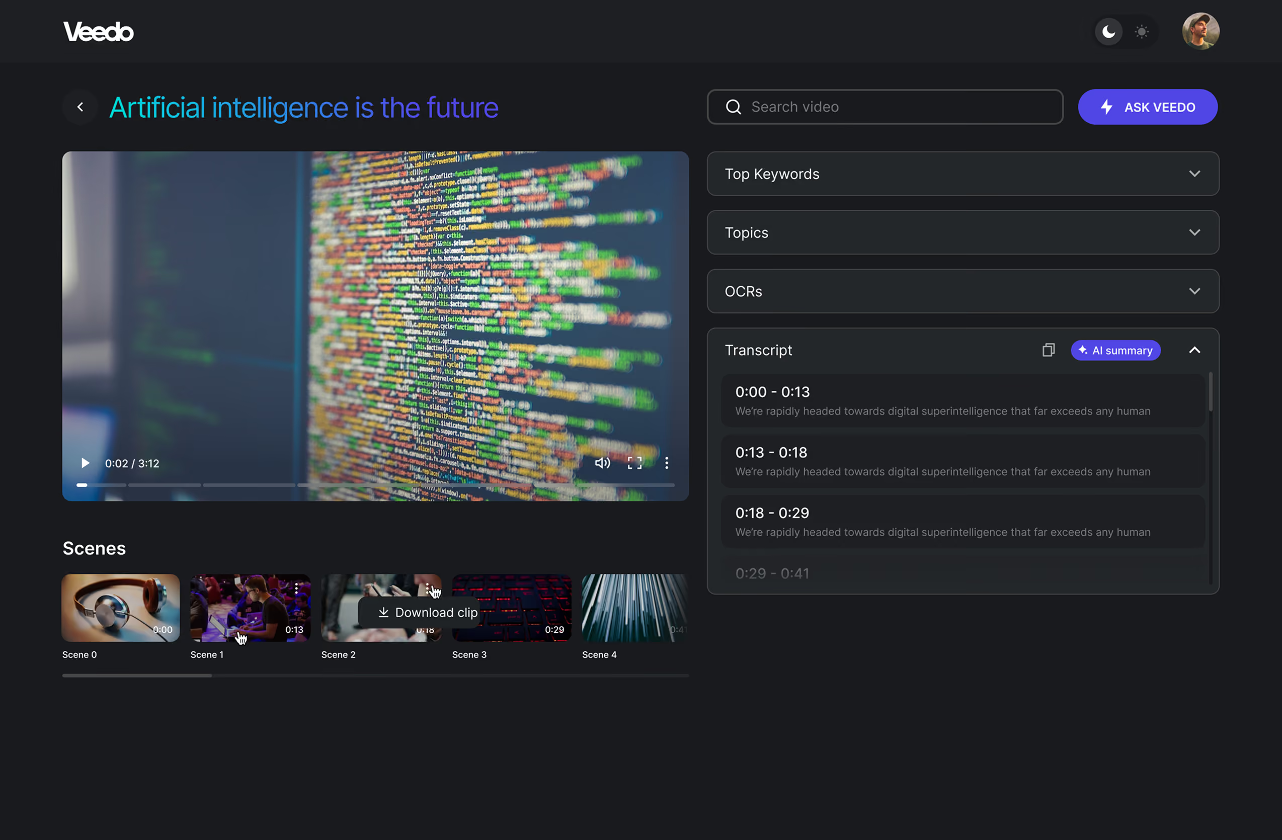
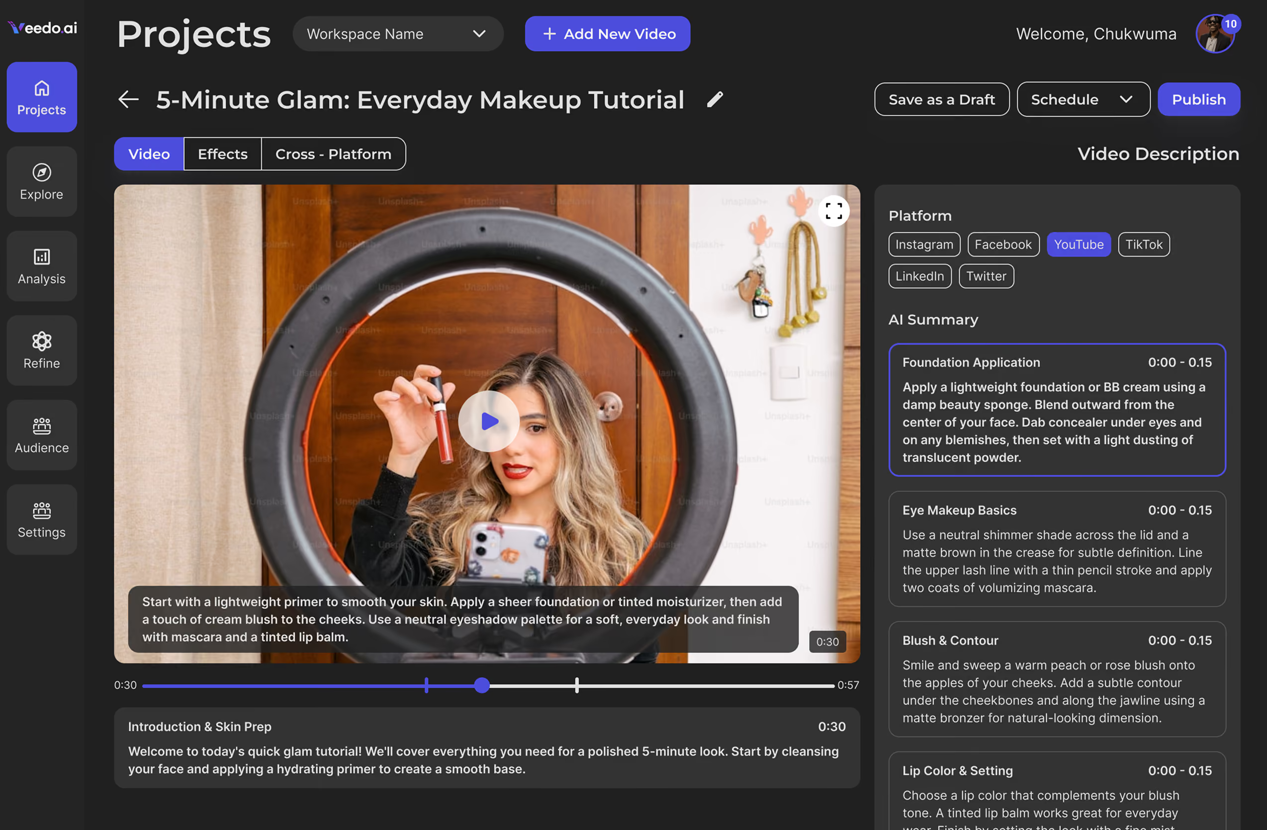
Progressive AI disclosure — a timing spec, not a principle
AI products fail in one of two directions: they hide what the model can do, or they dump every capability on a first-time user. I rewrote progressive disclosure as what the interface must have proven by which second, and held all four surfaces to it.
Why it mattered beyond the screens: it gave a four-person team a checkable rule for arguments that would otherwise have been taste. "Does this earn its place before the ten-second mark?" settled scope disputes faster than any mockup.
Every stage had a failure. This is the one I removed from each
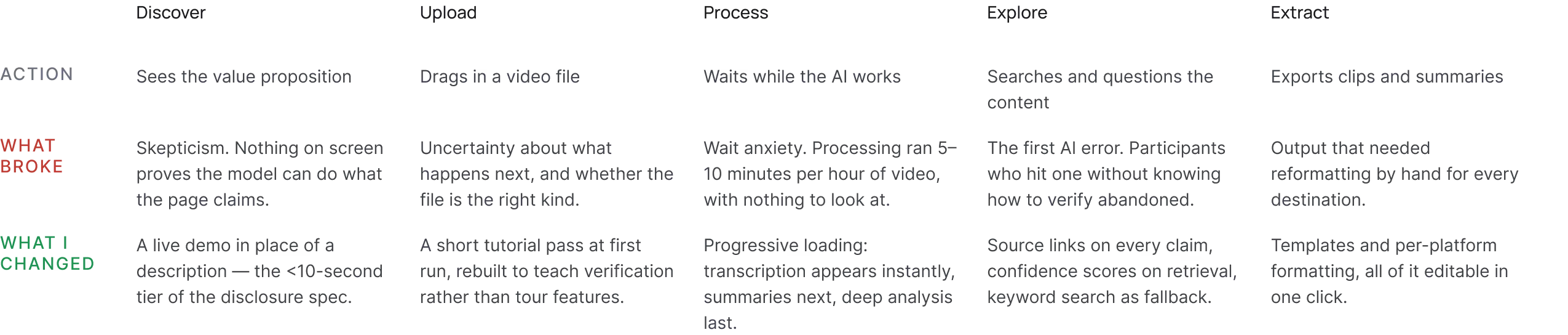
How I validated it — and what I couldn't
I ran moderated sessions on UserTesting and Lookback with professionals from all three segments, iterating between rounds. The consistent pattern: users didn't distrust the AI — they distrusted invisible AI. Every fix that worked made the system's reasoning more inspectable.
The change that mattered most came late: participants who skipped first-run setup were the ones who abandoned after their first AI error. Onboarding wasn't polish — it was where trust was established or lost, and I rebuilt it to teach verification rather than tour features.
You don't have to take my word for any of this
Three things I can point at rather than assert. All publicly checkable, none of them mine to edit.
Built as a system, so one designer could keep pace with four people shipping
The four surfaces share one component library — variants, tokens, handoff-ready. That's the only reason a solo designer kept pace with a founding team's roadmap: a new surface cost composition, not redesign.
The system outlived my engagement. The team kept building on the library after I left, without another designer on staff — the strongest evidence I have that it was built as infrastructure rather than as my own working file.
Two calls I made, and the pushback I took for them
On a four-person team there is no design org to escalate to. I made these calls, gave the founders the tradeoff, and owned what followed.
The disagreement: he wanted the interface to surface every model capability. I argued it should promise only what the model delivered reliably — an over-promise on a legal summary is unrecoverable, because the user doesn't conclude the feature is weak, they conclude the product lies.
What I did: I held the position and shipped the narrower promise. The cost was a product that demos smaller than it is, in a market where competitors demo everything.
The constraint: AI processing is expensive, and a flat price either priced out creators or lost money on heavy users. The tiering question was commercial, but the line had to be drawn somewhere a user could feel — which made it a design problem too.
What I did: I argued the split should fall on capability, not volume — basic search free, advanced AI and faster processing paid — so the free tier still demonstrated the thesis rather than teasing it. A metered free tier would have made the product feel broken before it felt useful.
The disagreement: growth wanted the shortest possible onboarding — every removed screen is a conversion gain. My testing showed the opposite risk: the users who skipped setup were the ones who churned on their first AI error, because nothing had taught them how to verify.
What I did: I traded signup-rate for activation quality and kept the verification moment in the first run, rather than optimizing the number I wasn't accountable for. The cost was friction at the top of the funnel that growth had legitimate reason to dislike.
What didn't move, what did, and what changed beyond the product
What did move: four months from first interview to launch, and 7,000+ creators and businesses across five industries — validating the bet that comprehension speed, not feature count, was the differentiator.
The organizational outcome mattered as much: "out-design, not out-model" became how the founding team described the company — in prioritization arguments and against better-funded competitors. The design strategy became the business strategy.

I had the pleasure of working with Olha during our time together at VeedoAI, where she served as Director of Product and Brand Design. From day one, Olha brought a rare combination of creative vision, design excellence, and strategic thinking that had a transformative impact on our product and brand.
What I'd do differently
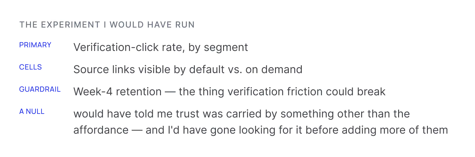
I'd define a behavioural trust metric — verification-click rate against retention — before launch, so the strategy is falsifiable rather than merely plausible.
One core loop across three segments worked, but cost sharpness in each. I'd start with legal, let its verification requirements set the bar, and expand outward — sharpening later is harder than widening later.
First-run friction surfaced in late-round testing, when changes were expensive. In any 0-to-1, onboarding validation belongs in the first round, not in launch polish.
Before you ask in the interview

Sole product designer on a four-person founding team. I owned research through hi-fi and design QA, the brand and design language, the component library, and the 27-interview research program. I influenced roadmap sequencing and positioning. I did not own model architecture, pricing, or paid acquisition.
The 7,000+ user figure was counted in production over the four months after launch. The 70% figure was observed in moderated sessions against participants' own existing workflow — not a controlled A/B test, and labelled that way. The cost-of-problem figure is modeled, with its inputs shown above.
Instrument the thesis before shipping it. The whole strategy rested on verification as the trust mechanism, and verification rate was never instrumented — so the core bet remained unfalsified at launch. I'd sequence instrumentation before launch and narrow to the legal segment first.
Ready To Start?
Book a free 30-minute discovery call
Tell me what you're building.
I'll tell you how I can help and exactly what it will cost.
Currently taking new clients · Typical start: 1–2 weeks from contract