Menu
Anticipated Outcomes
→ 0 to 20,000 Active Users
We project growing to 20,000 active users as Simplex helps families easily manage healthcare appointments and build trust in their providers.
→ 0 to 15,000 doctor appointments booked monthly
The app is expected to facilitate up to 15,000 appointments booked monthly, streamlining access to specialists nearby.
→ 0 to 5,000 social interactions per month
We anticipate 5,000+ social interactions monthly through leaderboards, team competitions, and shared achievements, fostering community.
→ 0 to 5,000 social interactions per month
We anticipate 5,000+ social interactions monthly through leaderboards, team competitions, and shared achievements, fostering community.
→ 0 to 10,000 specialist searches per month
Users are anticipated to conduct over 10,000 searches based on specialties, location, and availability, simplifying healthcare navigation.
→ 0 to 80% reduction in appointment booking time
With an intuitive, user-centric design, we expect a 30% boost in user retention and repeat bookings.
→ 0 to 30% increase in user retention
Patients may experience up to an 80% decrease in the time it takes to find and book the right doctor.
→ Up to 50% satisfaction boost for non-tech users
Simplex aims to significantly improve satisfaction and ease of use for patients with limited digital experience, expanding access to care.
The Starting Point
Finding and booking doctor appointments can be confusing and time-consuming for many patients. Often, people don’t fully understand medical specialties or how to choose the right healthcare provider. Existing booking systems tend to be complicated, slow, or fail to clearly show availability, causing frustration and delays in care.
This revealed a clear opportunity: What if scheduling a doctor’s visit could be as simple and intuitive as ordering a ride or food delivery?
Patients’ Initial Problems
Lost in Medical Choices
Many patients felt lost and overwhelmed trying to identify which specialist they needed and where to find the right one nearby.
Lengthy Booking Processes
The appointment booking process was often complex and involved multiple steps, causing users to experience delays.
Limited Medical Knowledge
Users often struggled to understand complex medical terminology and had little to no guidance in choosing the right specialist.
Poor User Experience
Booking platforms were often cluttered or designed for tech-savvy users, alienating less experienced patients.
Health Insights
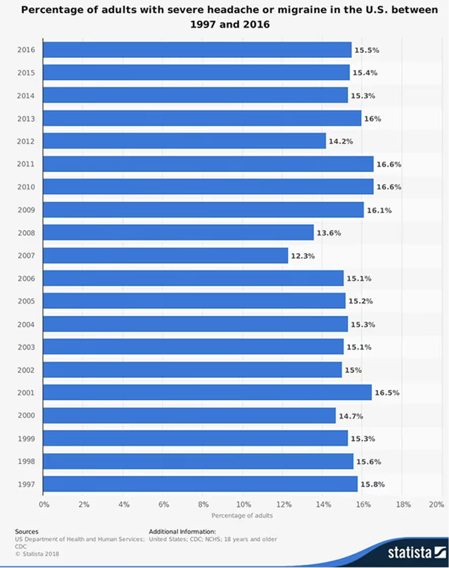
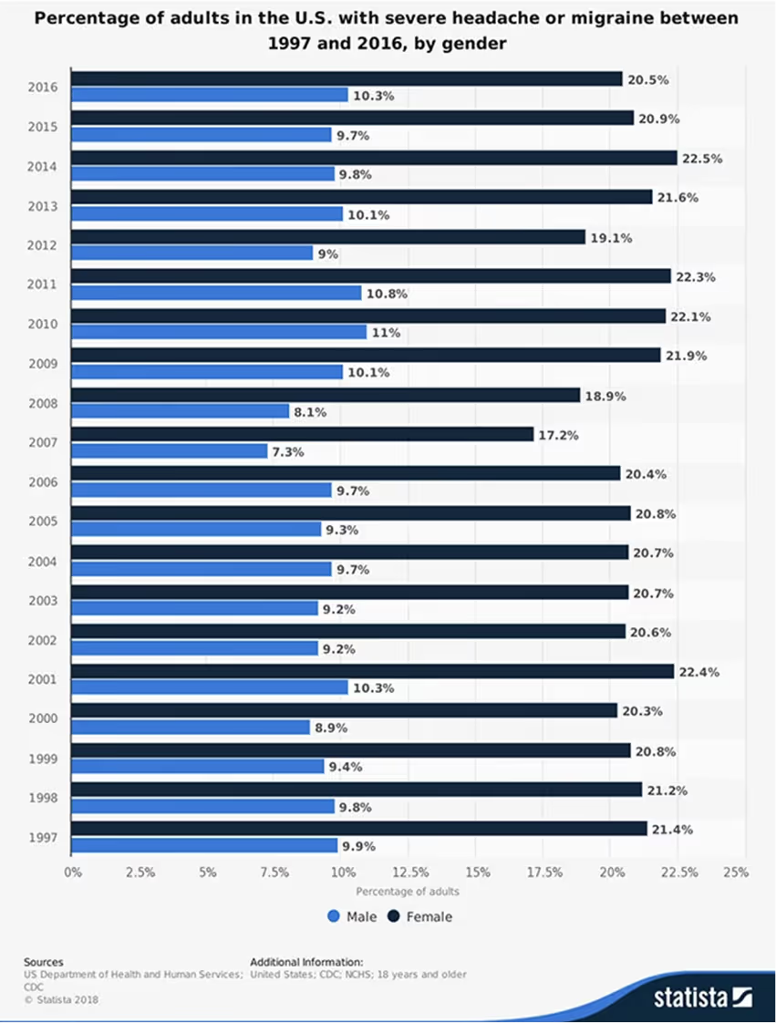
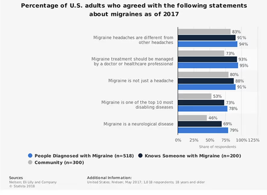
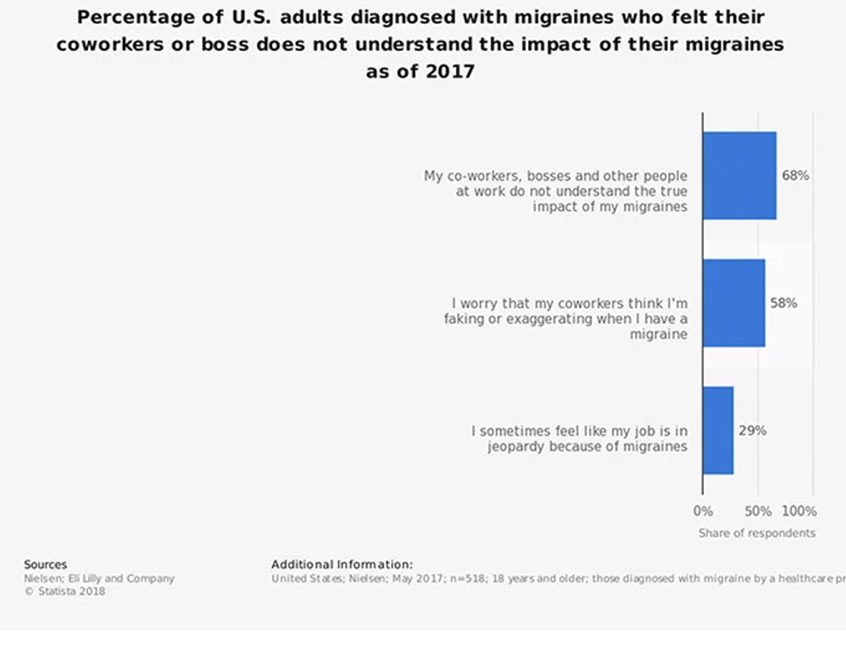
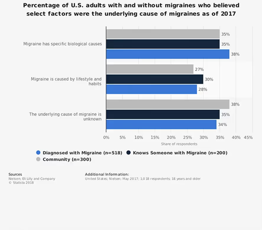
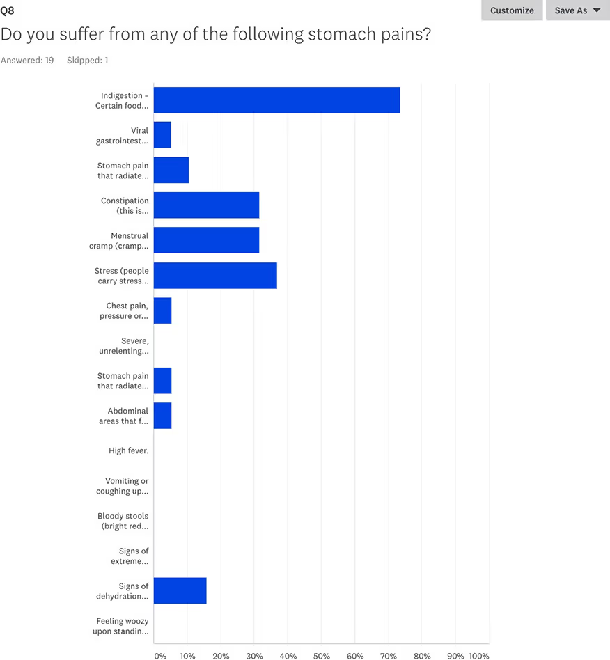
To design a solution that truly addresses user pain points, we began by analyzing health statistics from Statista. The data revealed that common issues like headaches and stomach pain are among the top reasons people seek medical care, highlighting the need for fast, intuitive access to the right specialists.

Meet the Users
To create a truly user-friendly healthcare booking experience, we focused on two core user personas—each with unique needs, goals, and digital habits.
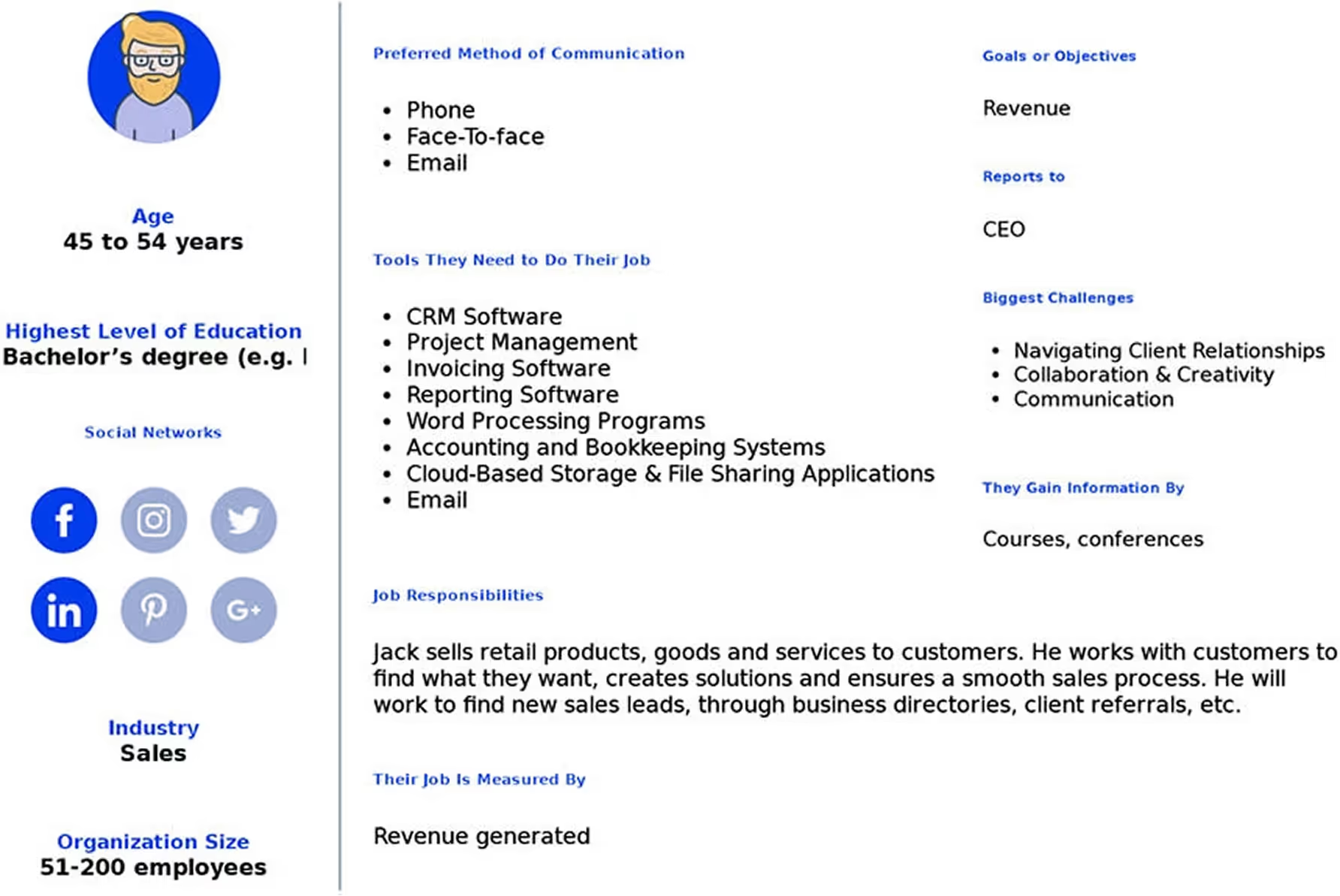
Jack - Patient
Jack is a busy working adult who seeks simplicity and speed when managing his healthcare needs.
Needs & Goals
Instantly find local healthcare providers with clear information
Book appointments in as few steps as possible
Understand who to see without medical jargon
Challenges
Often overwhelmed by specialty names and long profiles
Frustrated by complicated, slow booking systems
Seeks clarity and confidence before confirming an appointment
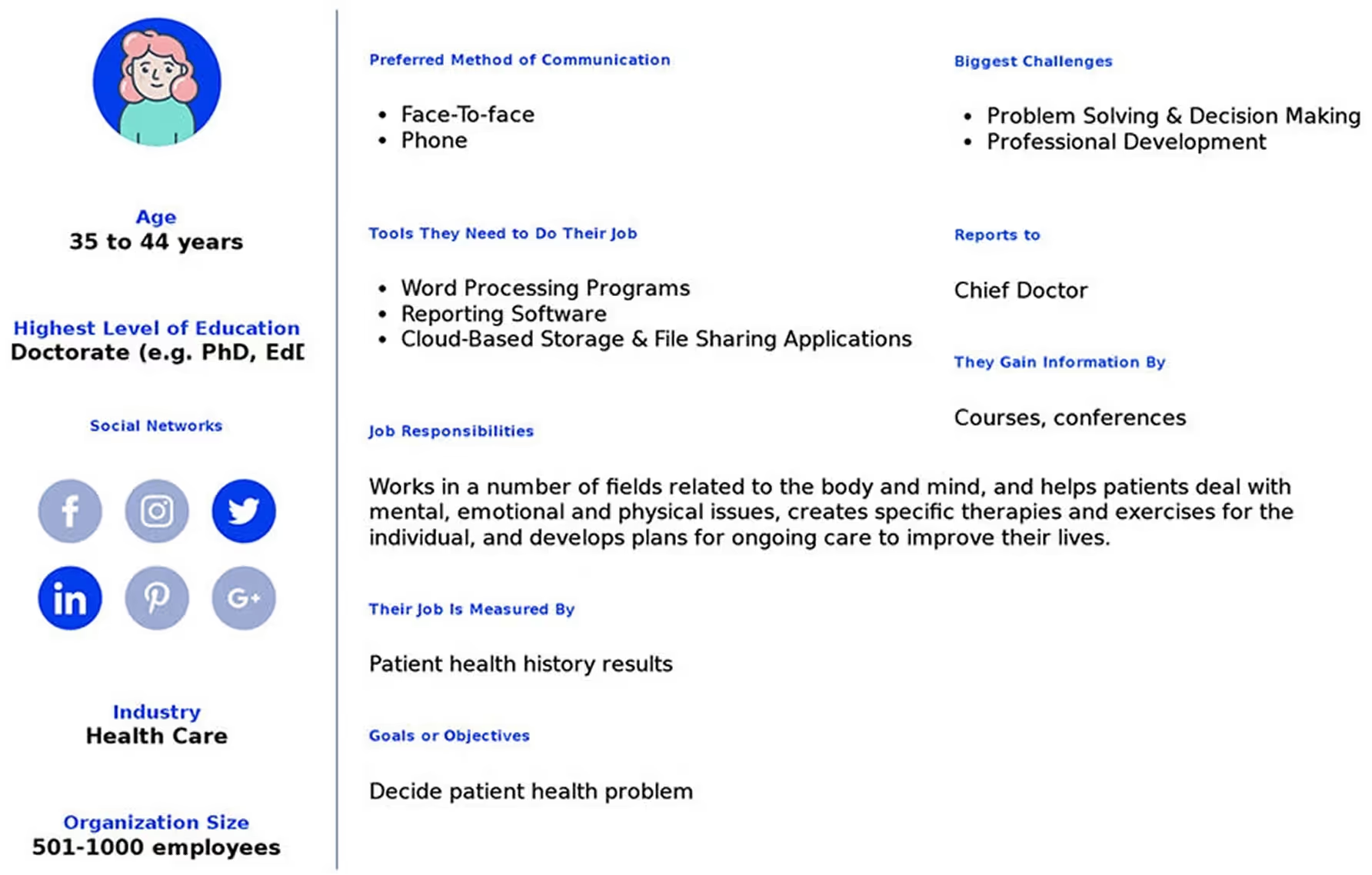
Jenny - Doctor
Jenny is a practicing doctor who relies on efficient tools to manage her schedule and patients.
Needs & Goals
Maintain a streamlined appointment calendar
Provide accessible and clear profiles to patients
Minimize no-shows with timely reminders
Challenges
Needs a platform that’s easy to update and manage
Concerned about accommodating patients with different tech familiarity
Requires secure and clear communication with her patients
Survey Insights
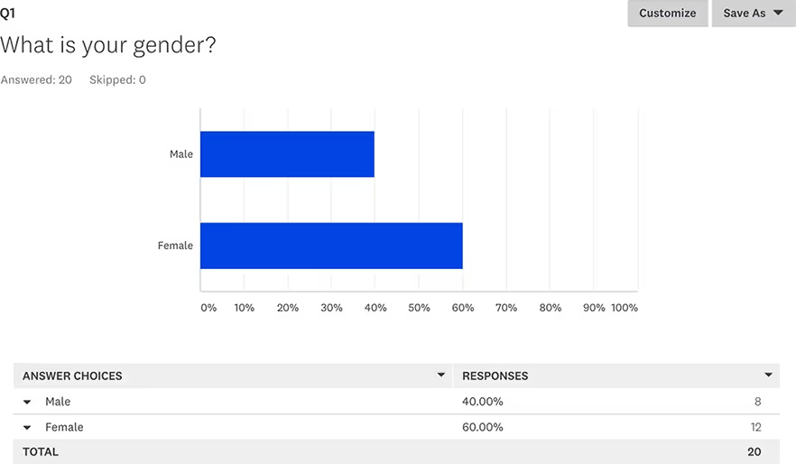
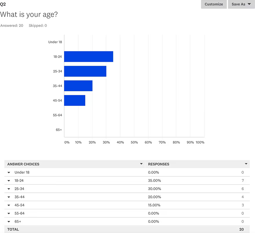
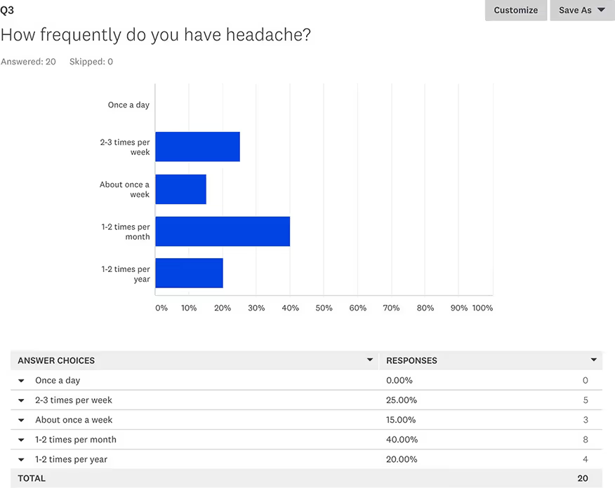
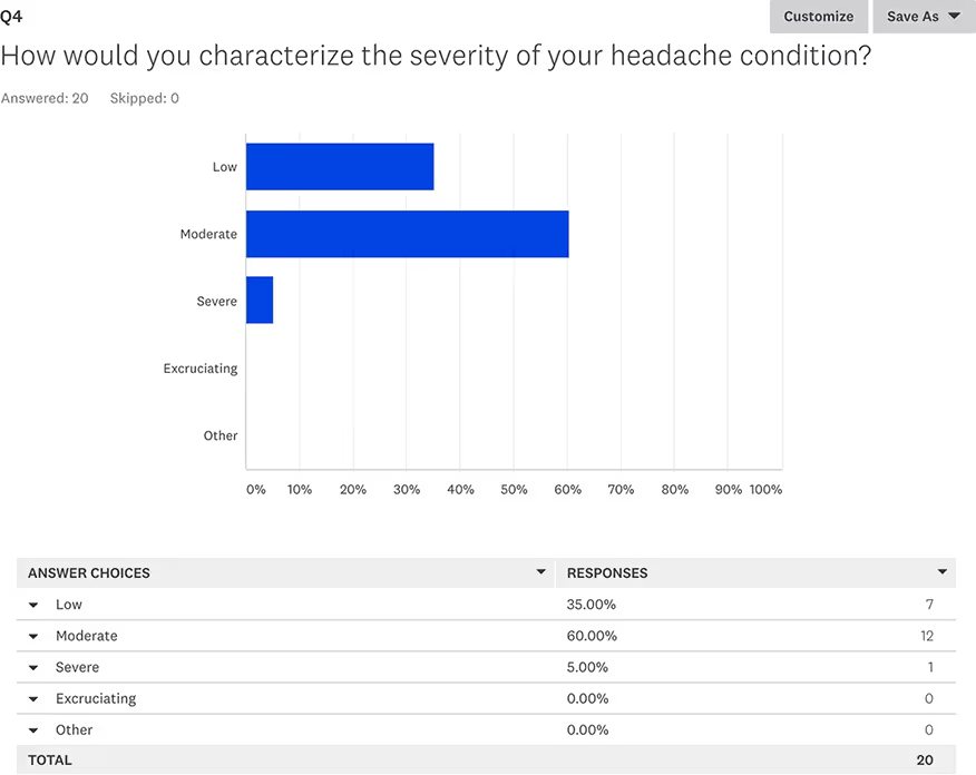
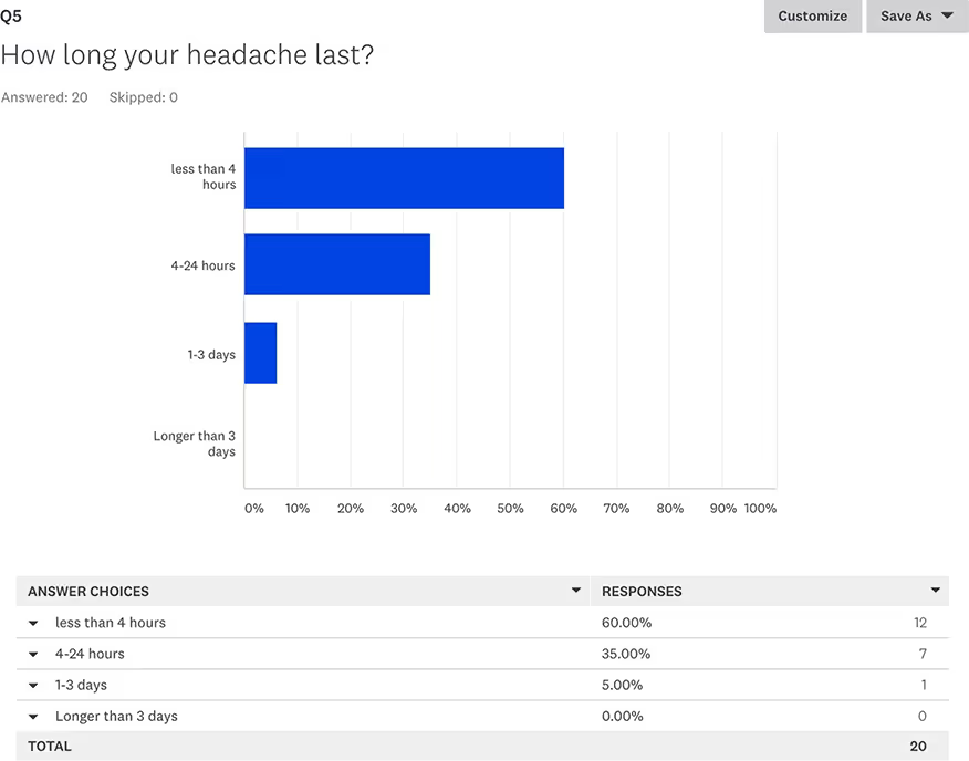
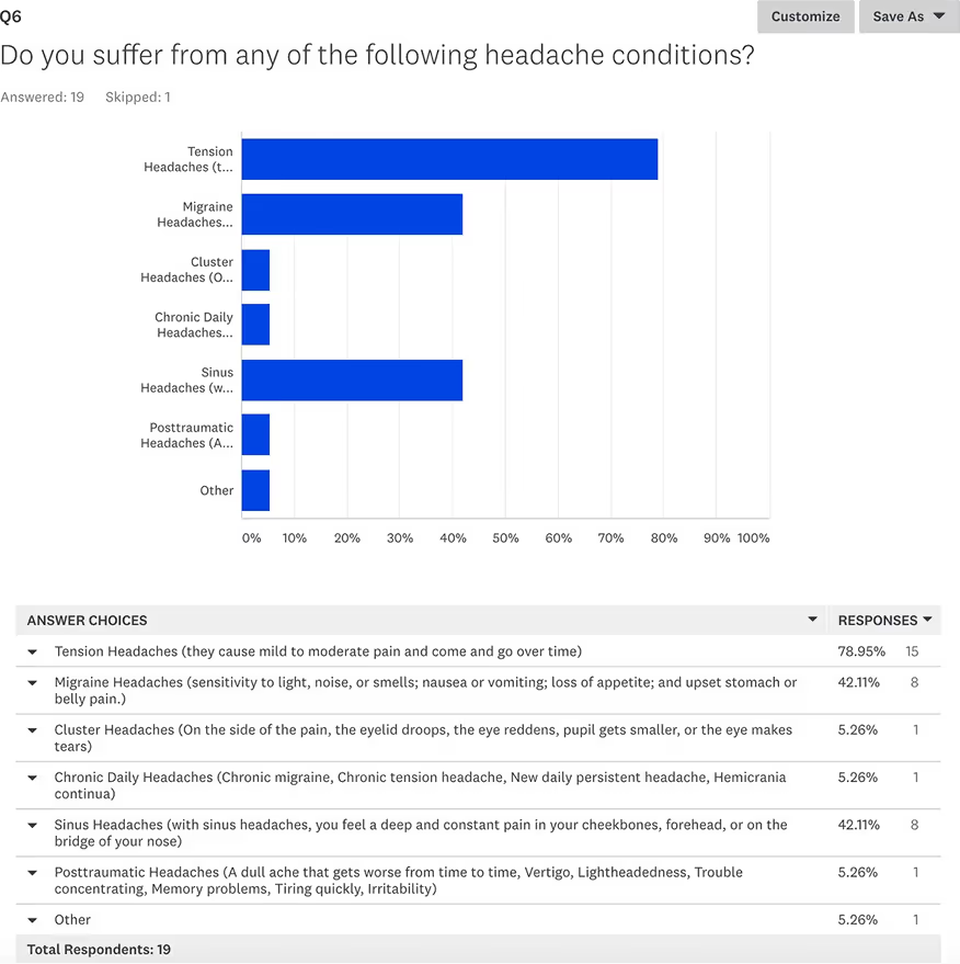
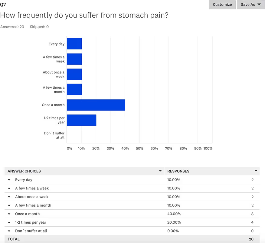
To better understand our target audience’s needs, pain points, and motivations, I conducted a user survey focused on daily wellness habits and collagen supplement usage. The insights gathered helped validate key assumptions, uncover unmet needs, and guide product positioning and design decisions.
Below are questions from the survey that helped shape the direction of the product and design.
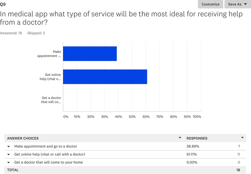
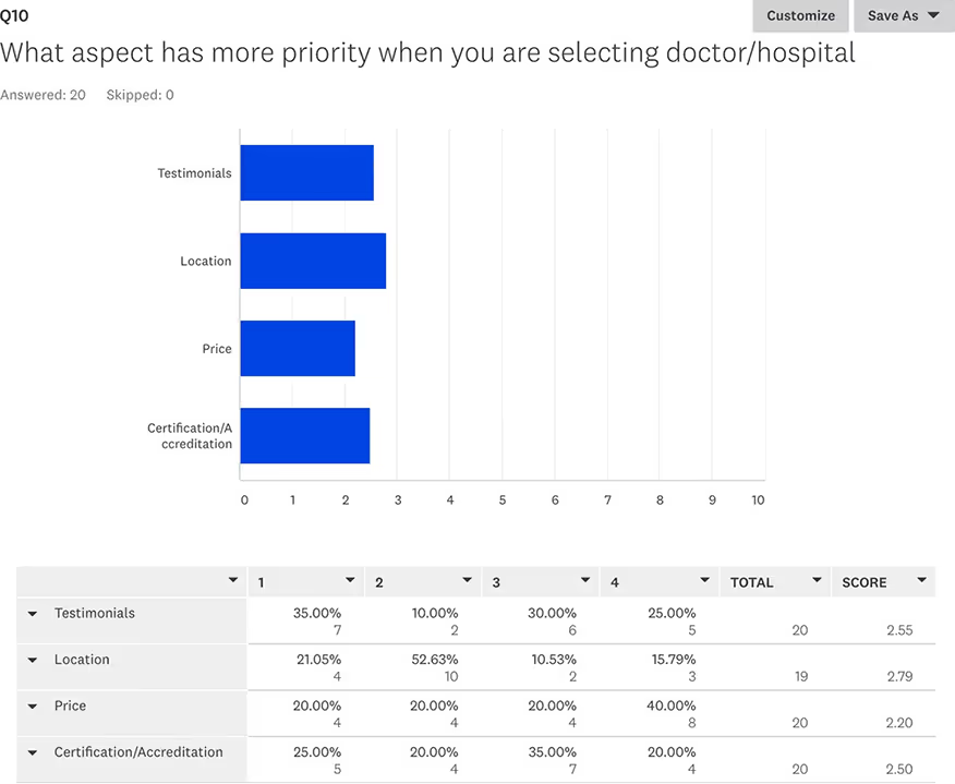
Out of all the competitors these are the closest that compare. At this moment we believe that Gamify Wellness is the simplest and easiest platform to navigate.
We suggest that Wefitter has the best product to serve the needs of the HR department. Based on our interviews Wefitter is not very known in our market.
Competitive Landscape
The healthcare appointment space includes major platforms like Zocdoc, Healthgrades, and Doctolib, each offering tools to search for providers and book visits online.
While effective, many of these platforms can feel overwhelming, especially for users unfamiliar with medical terms or digital interfaces.
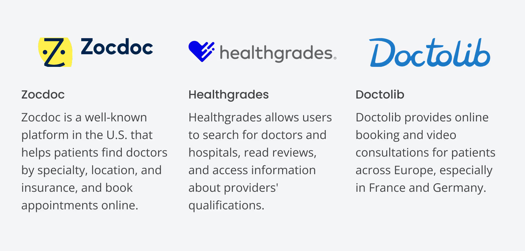
We suggest that Zocdoc currently offers the most robust feature set for users familiar with digital tools. However, based on our interviews, it can feel overwhelming to new or non-tech-savvy users and lacks localized support in some markets.
Doctolib is strong in the European market but has low awareness and adoption in the regions Simplex is targeting. This opens a clear opportunity for Simplex to lead with a simpler, more human-centered solution tailored to underserved users.
Framing the Flow
In the wireframing phase, I focused on creating the structural layout of the Simplex app to establish a clear, functional framework for the user interface.
By developing low-fidelity wireframes, I mapped out key screens and user flows, ensuring that the app’s layout and navigation were intuitive and aligned with user needs.
📌 Insight: This process involved defining essential elements, such as search functionality, appointment booking, and doctor profiles, to provide a solid foundation for further design refinement and development.
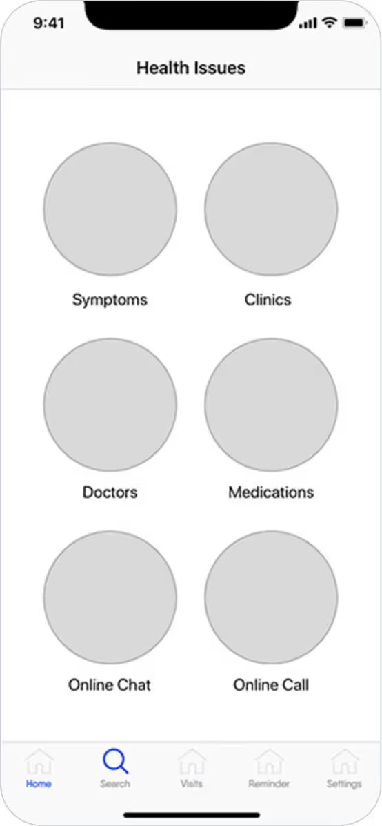
Health Issues selection
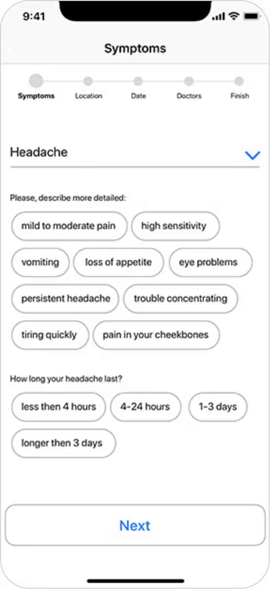
Symptoms Choice
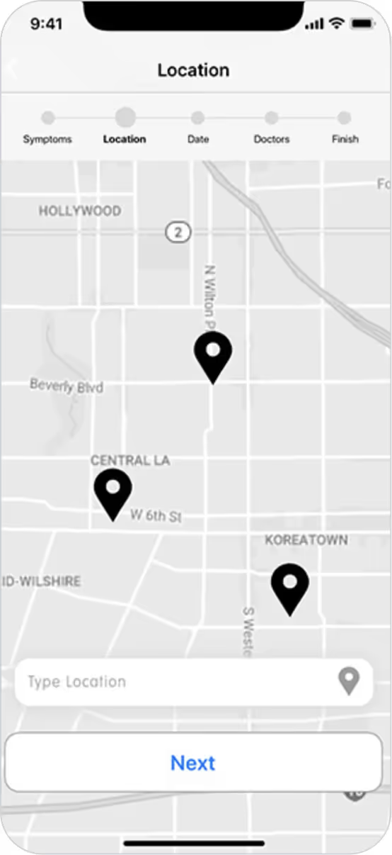
Hospital Location
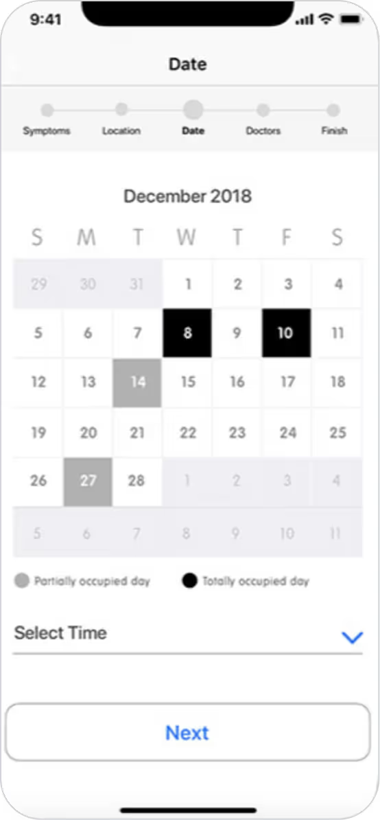
Appointment Date
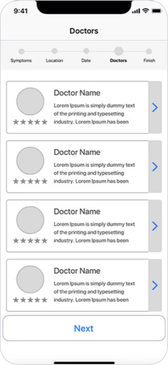
List of Doctors
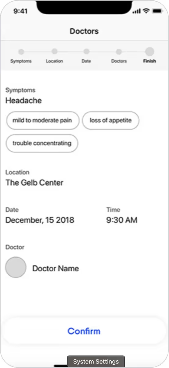
Appointment Review
Core Features Iteration
1. Streamlining Doctor Search & Appointment Booking
The core experience needed to simplify how users find and book with healthcare providers.
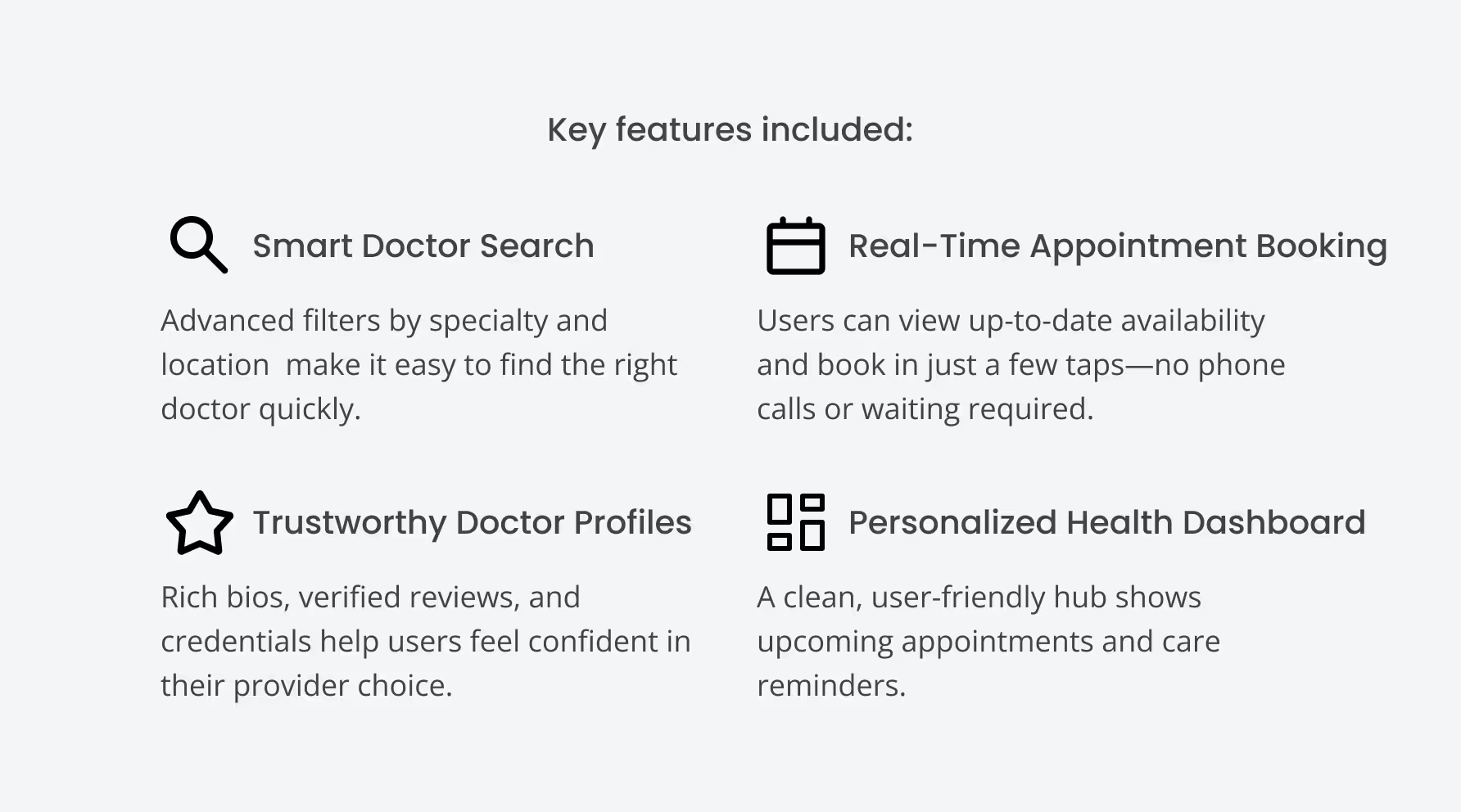
Smart filters and tags: Users could narrow searches by specialty, language, availability, and insurance coverage.
Real-time availability: Integrated scheduling allowed users to see up-to-date openings without needing to call.
One-tap booking flow: Reduced friction in the process by minimizing form fields and steps.
📌 Insight: User interviews revealed frustration with traditional booking methods. The design focused on speed, clarity, and reducing decision fatigue in high-stress health scenarios.
2. Building Trust with Transparent Provider Profiles
Users often hesitated to book due to lack of trust or unclear provider information.
Detailed doctor bios with photos
Detailed doctor bios with photos
Highlighting qualifications and specialties
💡 Result: These enhancements helped users feel more confident in their choices and led to faster decision-making during testing.
Usability Testing
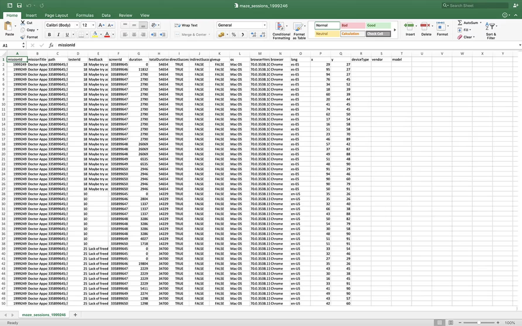
To validate design decisions and uncover friction points, I conducted remote usability testing using Maze. Participants were asked to complete core tasks such as searching for a doctor, booking an appointment, and navigating their dashboard.
The tests provided both qualitative and quantitative insights, helping identify usability issues early and prioritize improvements before final implementation.
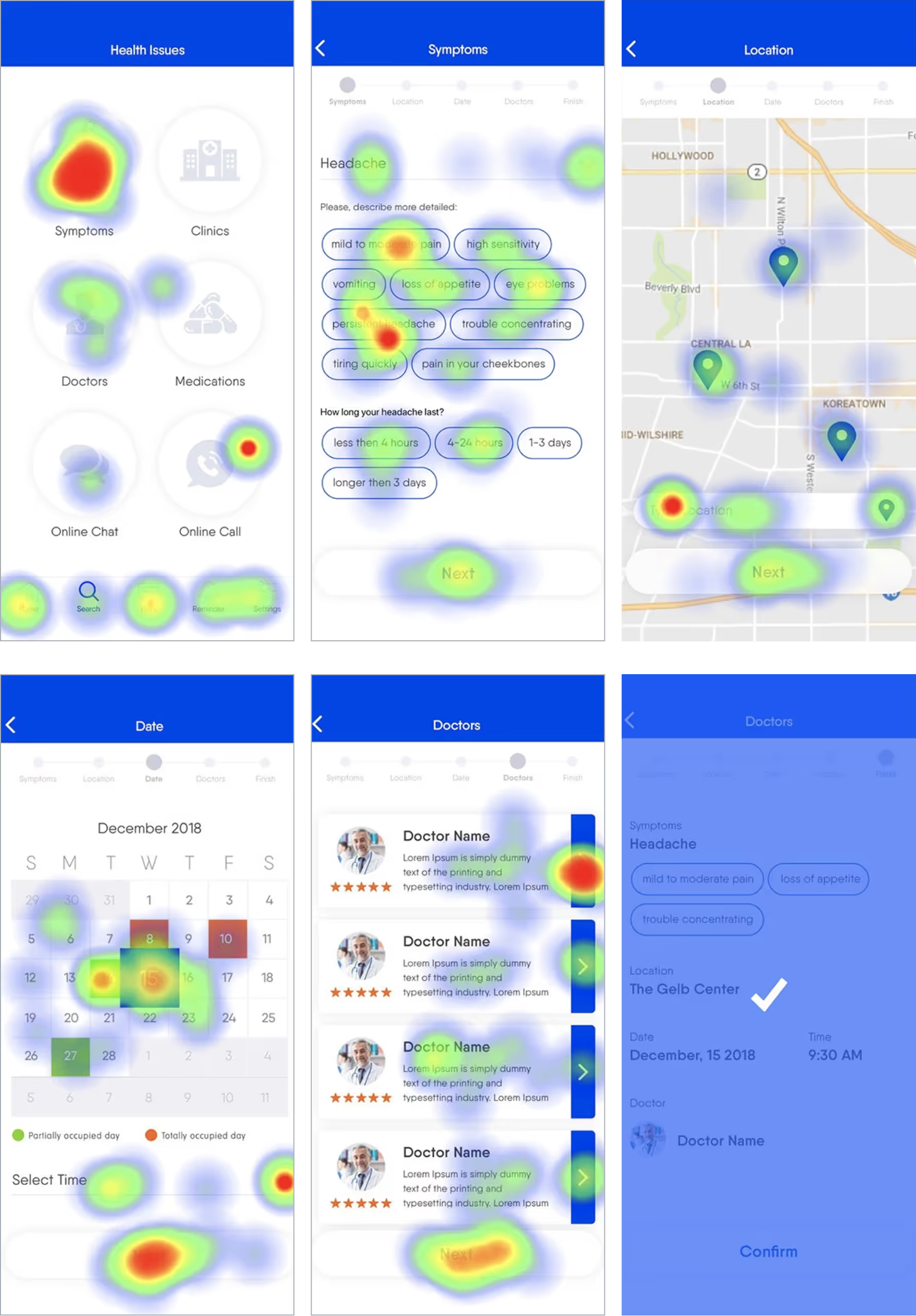
This data revealed how users engaged with different elements, highlighting areas of high and low interaction. The findings from usability testing and heatmaps informed final adjustments, ensuring the app’s interface was both intuitive and effective in meeting user needs.
Maze Dashboard
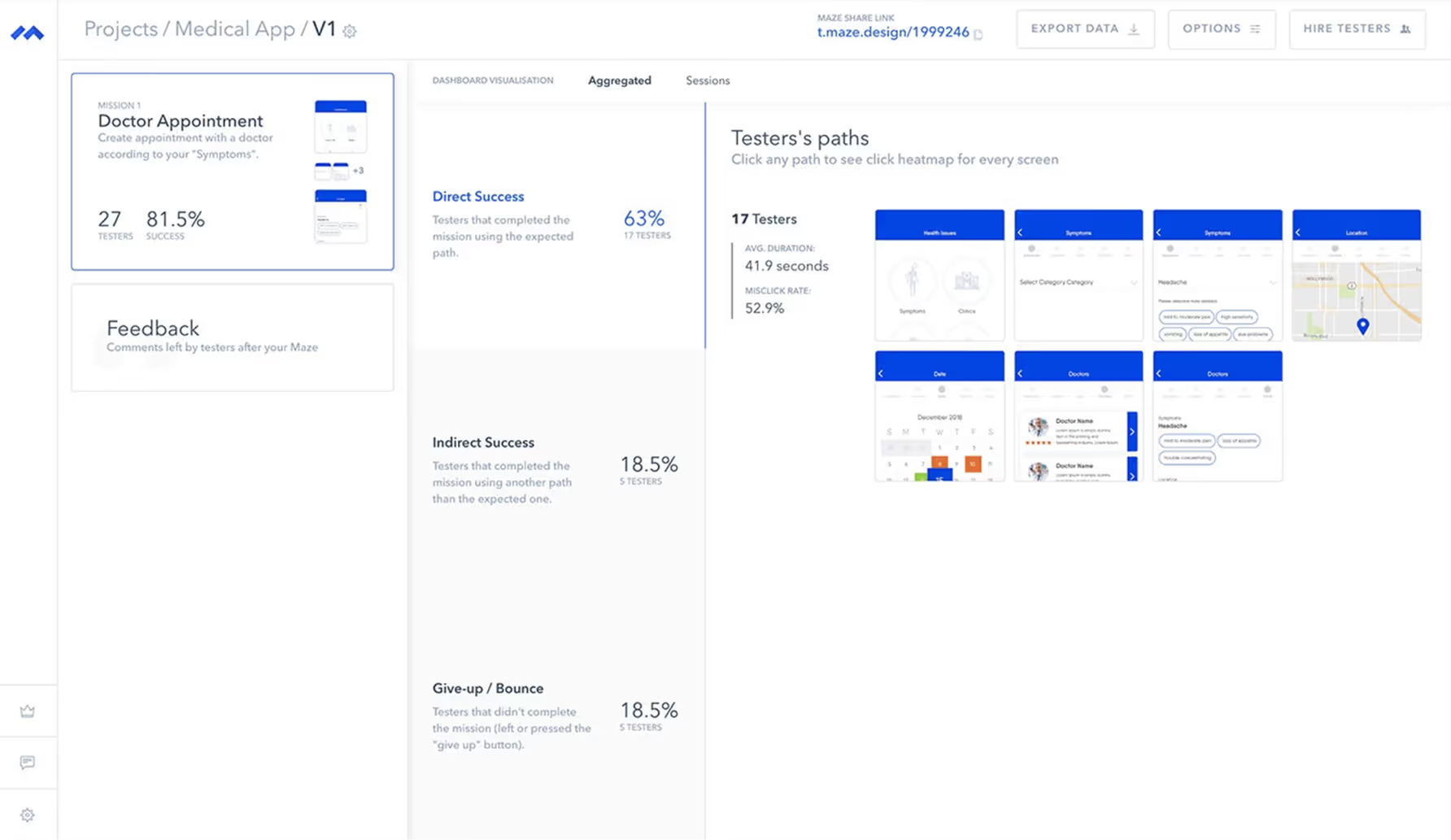
Maze Report
Heatmap
Final Design Reveal
My solution was to design a clean, intuitive healthcare app that simplifies doctor discovery and appointment booking while building trust through transparency and personalization. The UI emphasizes clarity, speed, and ease of use, especially for users navigating health concerns or managing care for others.
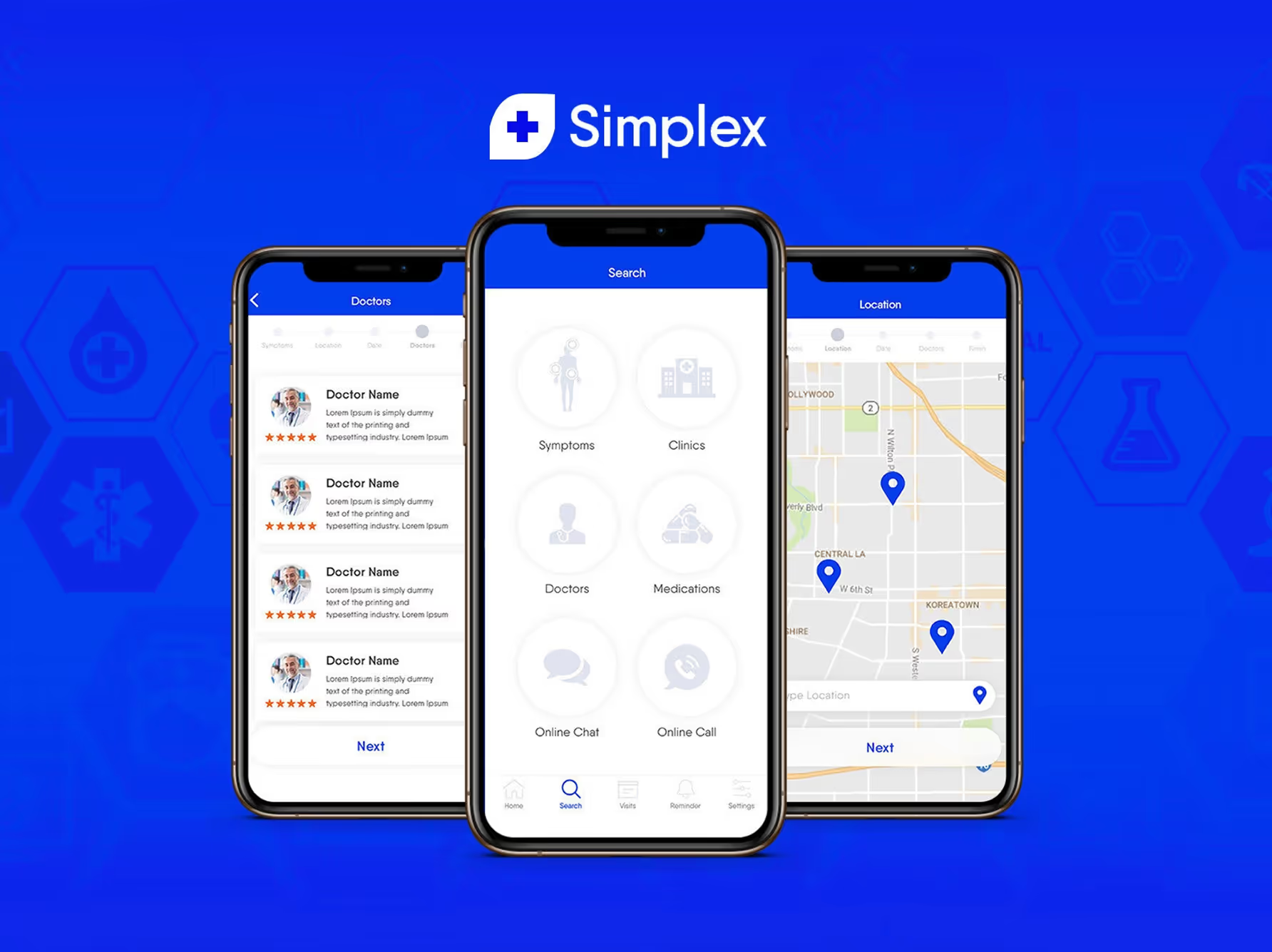
Main Screens
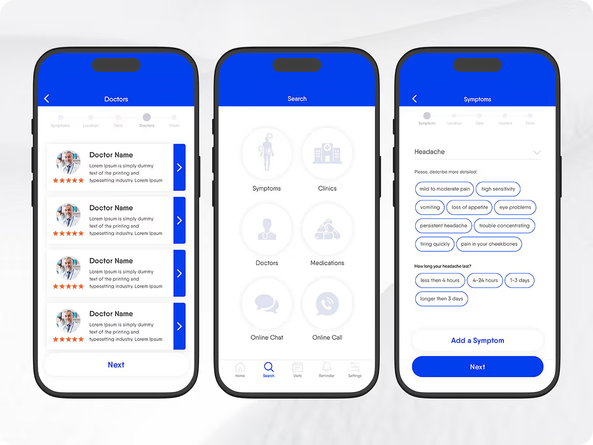
The dashboard provides users with an overview of app functionality, including sympoms, clinics, doctors, medication, online chat and a call option.
Doctors list includes highly vetted profiles with real reviews to build trust and help users make informed choices.
Location feature helps users find nearby hospitals and quickly book appointments for convenience and speed.
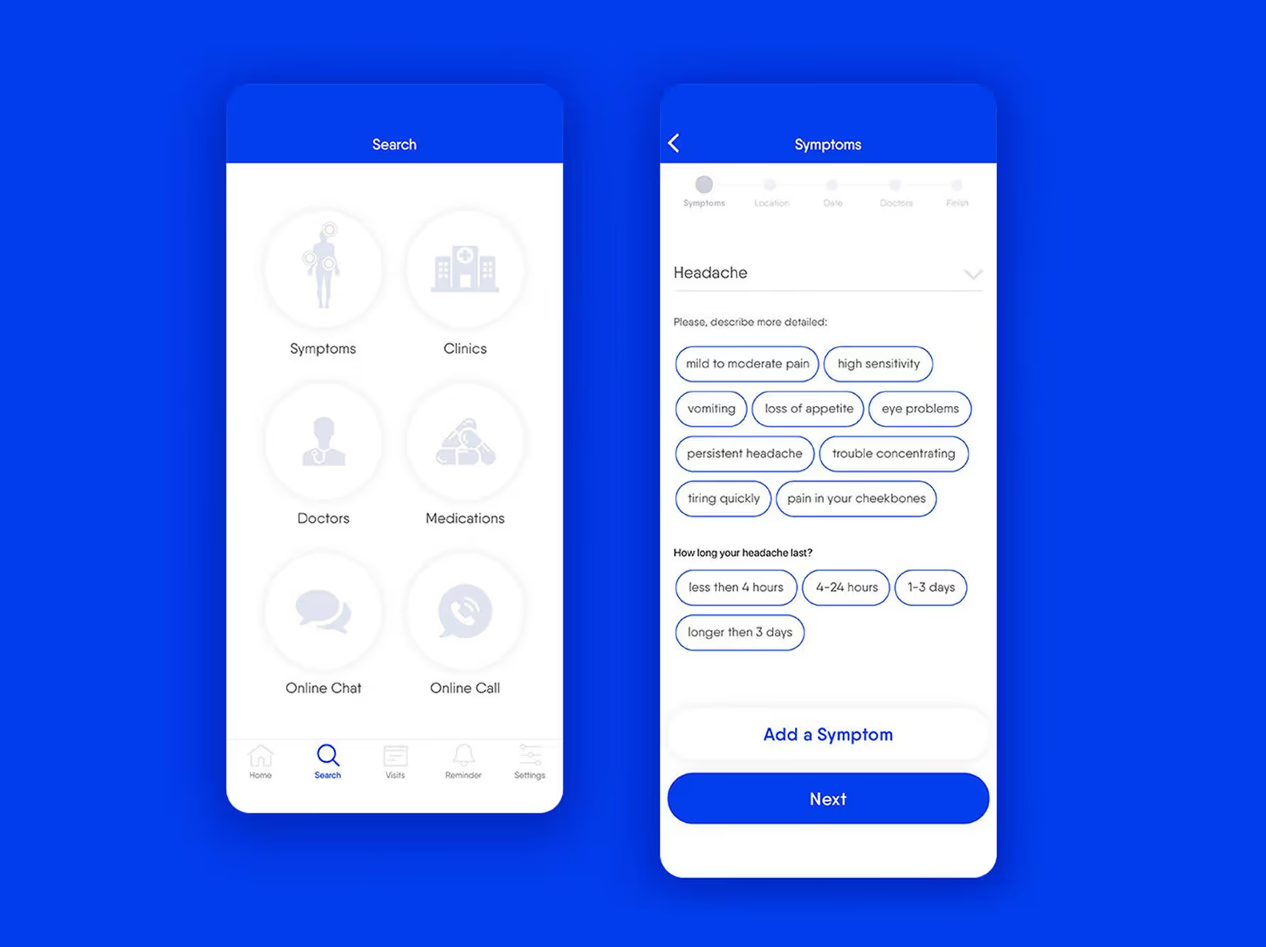
Symptoms
From the home screen, users can navigate to the Symptoms screen, which includes a dropdown to select a health issue, a field to describe how they’re feeling, and an option to specify how long the condition has been present.
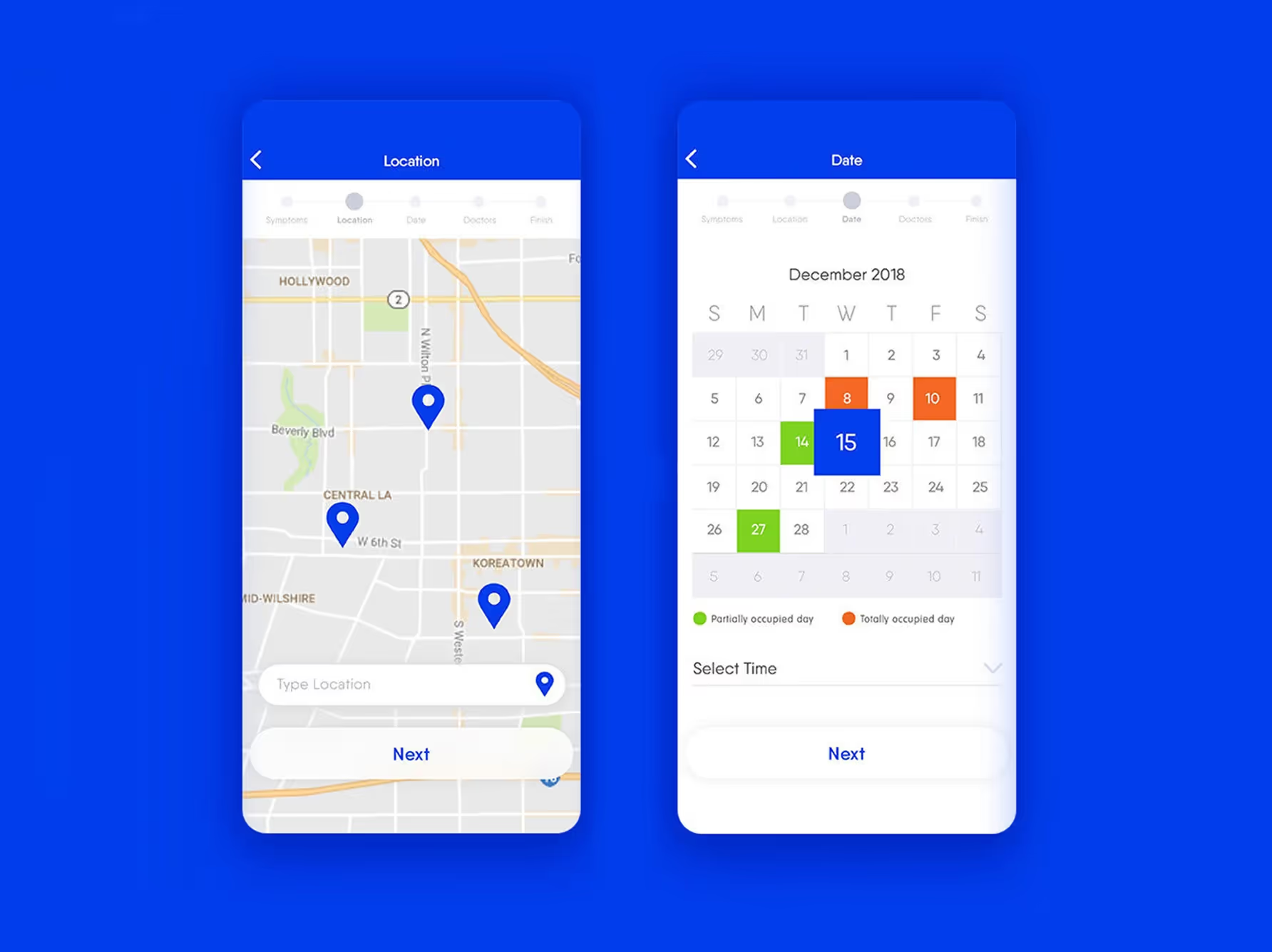
Location & Date
The Hospital Location screen displays nearby hospitals on an interactive map, allowing users to easily choose the most convenient option.
The Appointment Date screen lets users select an available date and time for their doctor visit, based on real-time availability.
Doctors & Confirmation
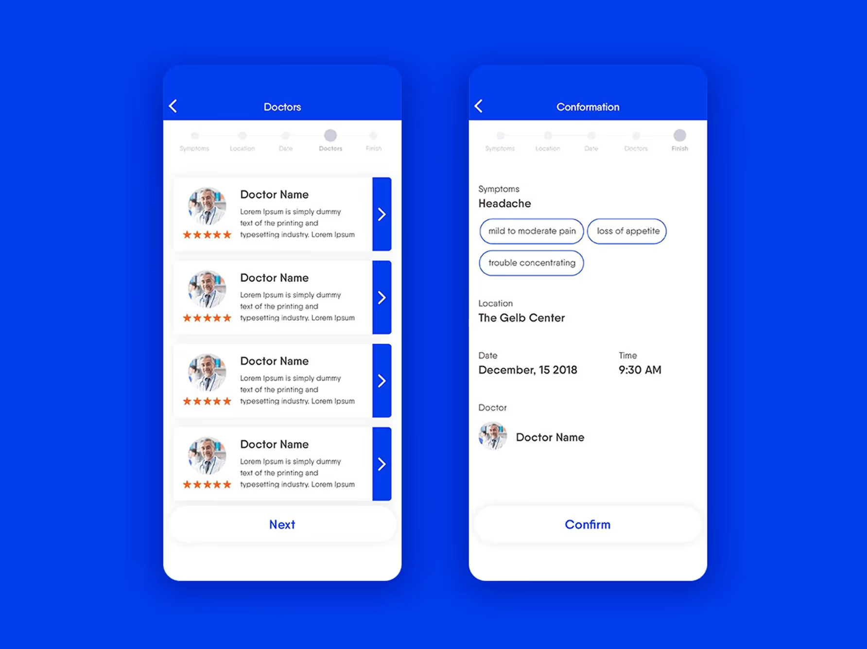
The Doctors List screen presents a selection of available physicians with detailed profiles, including specialties, ratings, and patient reviews to support informed decision-making.
The Appointment Confirmation screen summarizes the selected doctor, date, time, and location, giving users a clear overview before finalizing their booking.
Key Learnings
1. Small UX Improvements Drive Big Impact
Simplifying medical terminology made information easier to understand and reduced user hesitation.
Showing real-time doctor availability increased booking speed and user confidence.
2. Trust Is as Critical as Functionality
Detailed doctor profiles with verified reviews helped users feel more secure in their choices.
Transparency led to higher engagement during the provider selection process.
3. One Design Doesn’t Fit All
Users had varying levels of tech familiarity and health needs, so flows needed to feel intuitive and non-overwhelming.
Personalization and simplicity were key to ensuring the experience worked well for a broad, diverse audience.
