Problem
Without a shared system, designers and developers struggled to stay aligned. This led to duplicated efforts, fragmented interfaces, and delays in delivering family-focused features.
Design fragmentation led to 60%+ duplicate components and 30% more developer effort. I built a token-based design system from scratch, enabling 3× faster rollout and 100% adoption in two months.
The design system launched with over 25 production-ready components, reducing redundant design efforts and ensuring consistent user interfaces across the platform.
Standardized components and tokens enabled teams to ship new features up to 3x faster, improving time-to-market and internal efficiency.
A unified system decreased UI inconsistencies, reducing QA rounds and post-release fixes by 30%.
Design and development teams fully adopted the system within 2 months, improving collaboration and reducing friction across workflows.
Most new screens now rely on existing components, increasing scalability and reducing the need for custom design solutions.
Audits showed a 40% improvement in visual consistency across products, enhancing brand trust and user satisfaction.

Olha has amazing talent and knows how to bring your vision to life. She has a vast knowledge of design and stays up-to-date with the ins and outs of interactive design. She will always be my go-to when I want to put a team together for a new project.
In early 2019 I identified a critical challenge within the FamHub Network product team. Design fragmentation was slowing development and causing inconsistent user experiences across platforms. Without a shared foundation designers and developers duplicated efforts struggled to stay aligned and faced delays delivering new family focused features.
More than 60% of design components were duplicated across platforms, a challenge also reported in Microsoft Fluent Design rollout. Developers were spending up to 30% more time recreating existing UI patterns, aligning with data from Zeroheight that shows design systems reduce development time by 37–40%.
Through stakeholder interviews and UI audits we uncovered several core issues impacting both teams and users.
Different teams used varying styles spacing and components resulting in a disjointed look and feel that confused users and weakened the brand.
Repeatedly designing and coding similar UI elements caused wasted time and introduced subtle inconsistencies.
Absence of a documented system meant onboarding new team members was slow and communication between designers and developers was inefficient.
As the platform grew the lack of a unified design system made it increasingly difficult to maintain consistency across UI elements which led to more design discrepancies.
Before designing the system I led a comprehensive research and audit phase to uncover key pain points and build a foundation based on real product needs.
I began by interviewing developers and CEO to understand how they currently worked what slowed them down and what a successful design system would need to support Their feedback revealed that communication gaps duplicated efforts and lack of shared standards were common issues across teams.
Next I conducted a full audit of the existing product UI reviewing live screens and design files across web and mobile I documented inconsistencies in components typography color spacing and interaction patterns I also flagged areas with accessibility risks or unclear behavior.
In parallel I studied well established design systems like Material Design Polaris and Carbon to identify best practices for token naming responsive behavior and documentation structure.
This phase helped align the team on what the system should solve and ensured that future components and tokens would be grounded in actual use cases and scalable across the platform.
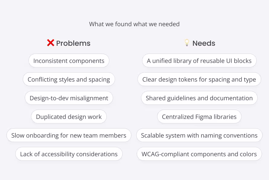
With the audit insights in place I mapped out a clear structure for the design system focused on flexibility scalability and team adoption.
I started by defining the core foundations of the system including colors, typography, spacing, and layout. Each foundation was converted into design tokens to ensure consistency and easy maintenance across platforms.
Next I outlined a modular component strategy Components were built to be responsive accessible and flexible enough to support multiple use cases from dashboards to task views.
To keep the system sustainable I established clear naming conventions versioning practices and a scalable folder structure in Figma This made it easier for teams to find reuse and update components.
I also planned for documentation early creating a structure for how-to guides usage rules and token references to be built in parallel with the component library.
This planning phase ensured the design system was not only consistent but also ready to scale with the product and the team.
The color system was designed to balance brand expression with functional clarity while ensuring accessibility across all use cases.
I defined a flexible and accessible palette that includes.
Core Brand Colors
Primary and secondary colors aligned with the FamHub brand identity providing visual consistency across marketing and product touchpoints.
Neutral Colors
A structured grayscale system used for backgrounds text dividers and UI containers supporting clear hierarchy and contrast.
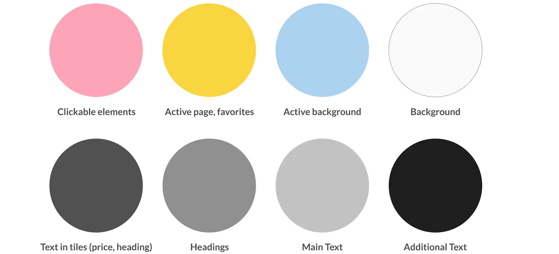
All colors were converted into design tokens grouped by purpose and applied consistently across components layouts and themes.
This structured approach ensures the product maintains visual harmony while being flexible enough to evolve with future branding needs.
The typography system was built to support clarity readability and visual hierarchy across all screens and devices.
I selected a modern and accessible font pairing optimized for digital interfaces ensuring legibility for a wide range of users.
Text Styles by Purpose
Defined heading body caption and label styles each with specific roles in establishing hierarchy and guiding attention.
Scalable Type Ramp
Created a responsive scale with consistent vertical rhythm across breakpoints supporting both mobile and desktop views.
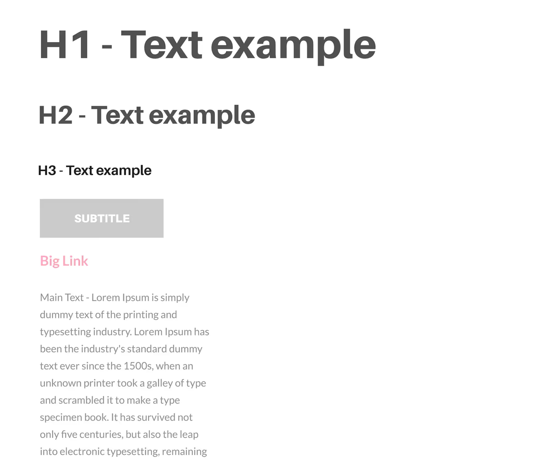
This typography structure not only enhances the visual appeal of the interface but also strengthens communication and usability for families navigating the platform.
A consistent spacing system was essential to create visual rhythm, improve scanability, and support responsive layouts across the platform.
I developed a scalable spacing scale based on a base unit of 5 pixels to bring structure and predictability to the interface.
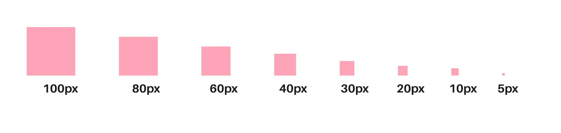
The system includes:
Defined Scale
Spacing values of 5, 10, 20, 30, 40, 60, 80 and 100 pixels were used across padding margins and layout gaps These values covered everything from tight element spacing to generous section padding.
Responsive Flexibility
The scale was designed to work across mobile and desktop ensuring consistent spacing behavior at every breakpoint.
Built-In Component Spacing
Spacing rules were embedded directly into components like buttons cards inputs and modals reducing repetitive decisions and alignment issues.
Tokenized Implementation
Spacing rules were embedded directly into components like buttons cards inputs and modals reducing repetitive decisions and alignment issues.
This unified spacing system helps teams build clean and breathable interfaces while keeping layout logic simple and repeatable.
To ensure consistency across screen sizes I developed a responsive layout system built on a flexible grid structure tailored to the needs of the FamHub platform.
The layout system supports four breakpoints and is optimized for both content density and readability across devices.
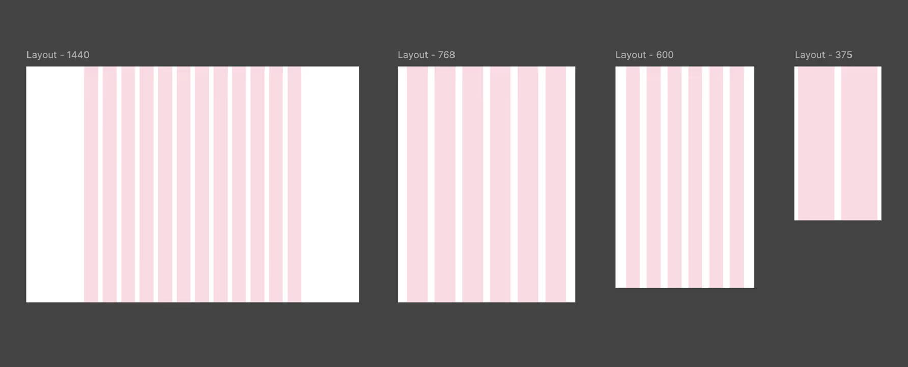
The system includes:
Desktop Grid (1440px)
• 12 columns
• Column width 60px
• Gutter 20px
• Offset 250px
• Used for dashboards and complex interfaces with high information density
Tablet Grid (768px)
• 6 columns
• Column width 90px
• Gutter 30px
• Offset 39px
• Optimized for mid-sized views and touch interactions
Small Tablet Grid (600px)
• 6 columns
• Column width 60px
• Gutter 30px
• Offset 45px
• Designed for compact content while preserving structure
Mobile Grid (375px)
• 2 columns
• Column width 158px
• Gutter 30px
• Offset 15px
• Supports simple linear layouts and large tap targets for accessibility
The layout grid was tokenized for easy integration into design and development workflows and used consistently across components and pages to ensure alignment clarity and responsive adaptability.
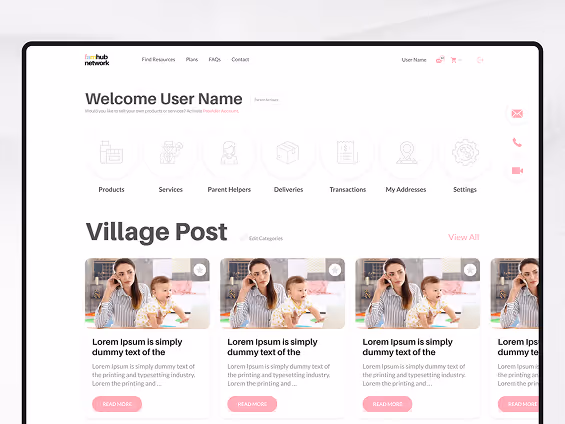
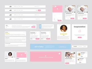
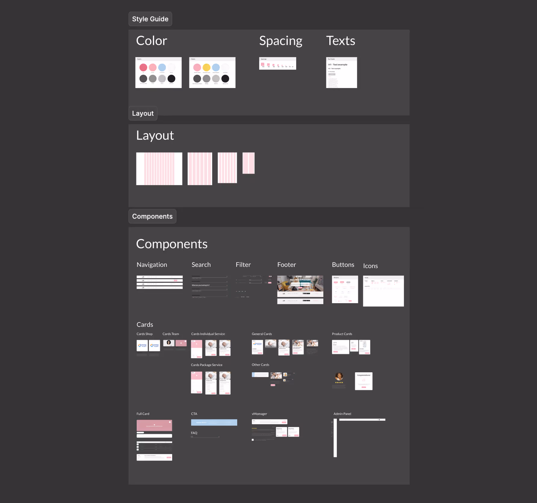
The component library was built to be scalable accessible and consistent across the entire FamHub platform It includes both foundational elements and complex modules designed to support user engagement and internal operations.
Each component follows the design system foundations including color typography spacing and layout and was built with responsiveness and accessibility in mind.
The library includes:
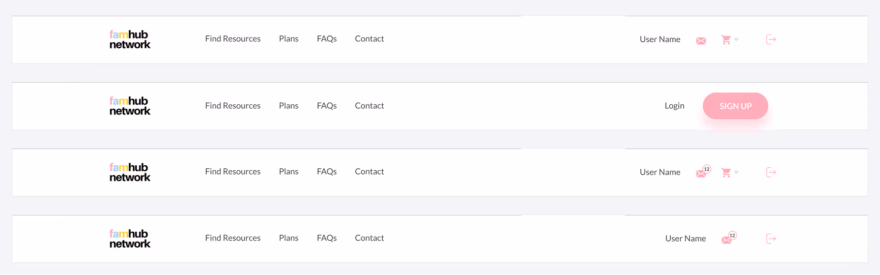
Navigation
Responsive top navigation and sidebars with clear structure and support for authenticated states.
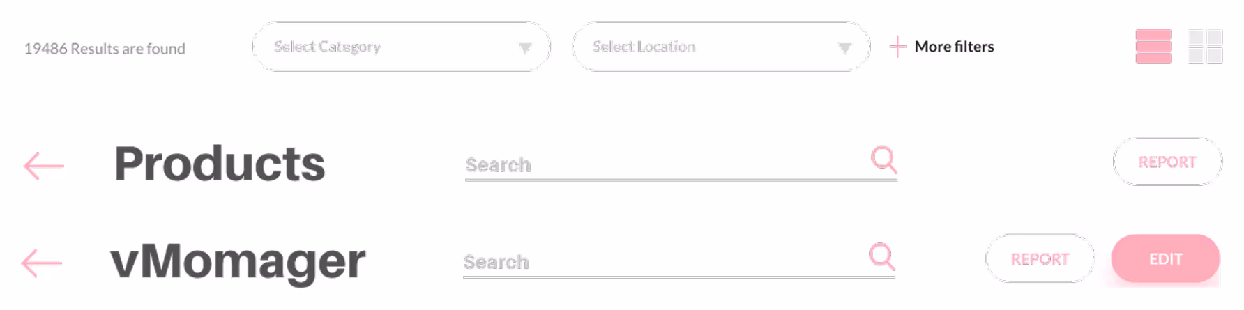
Search
Universal search input with autosuggest loading states and error handling.
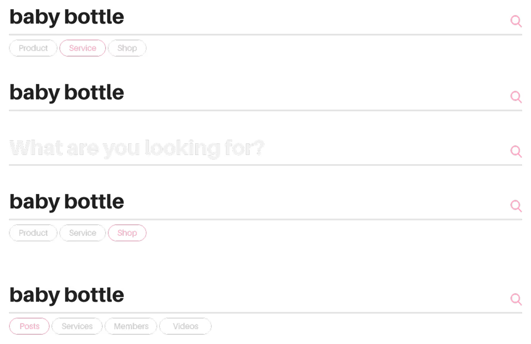
Filter
Flexible filtering patterns supporting tags checkboxes dropdowns and multi-select for product and content discovery.
Progress Bar
A flexible progress bar used in onboarding profile completion and service tracking.
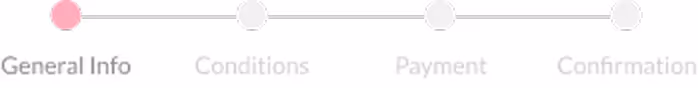
Tabs
A simple three-tab component used to organize related content within limited space designed for clarity and ease of navigation.

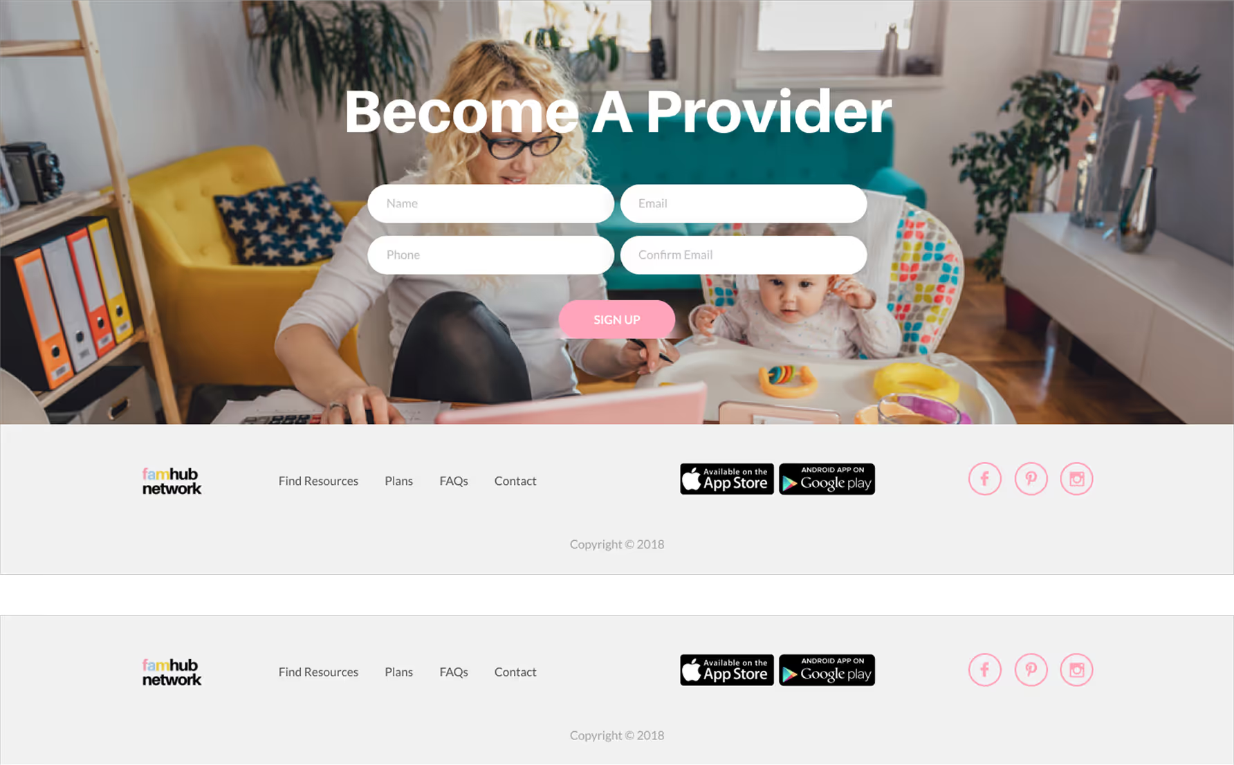
Footer
Responsive footer with grouped links social media and contact sections adaptable for different screen sizes.
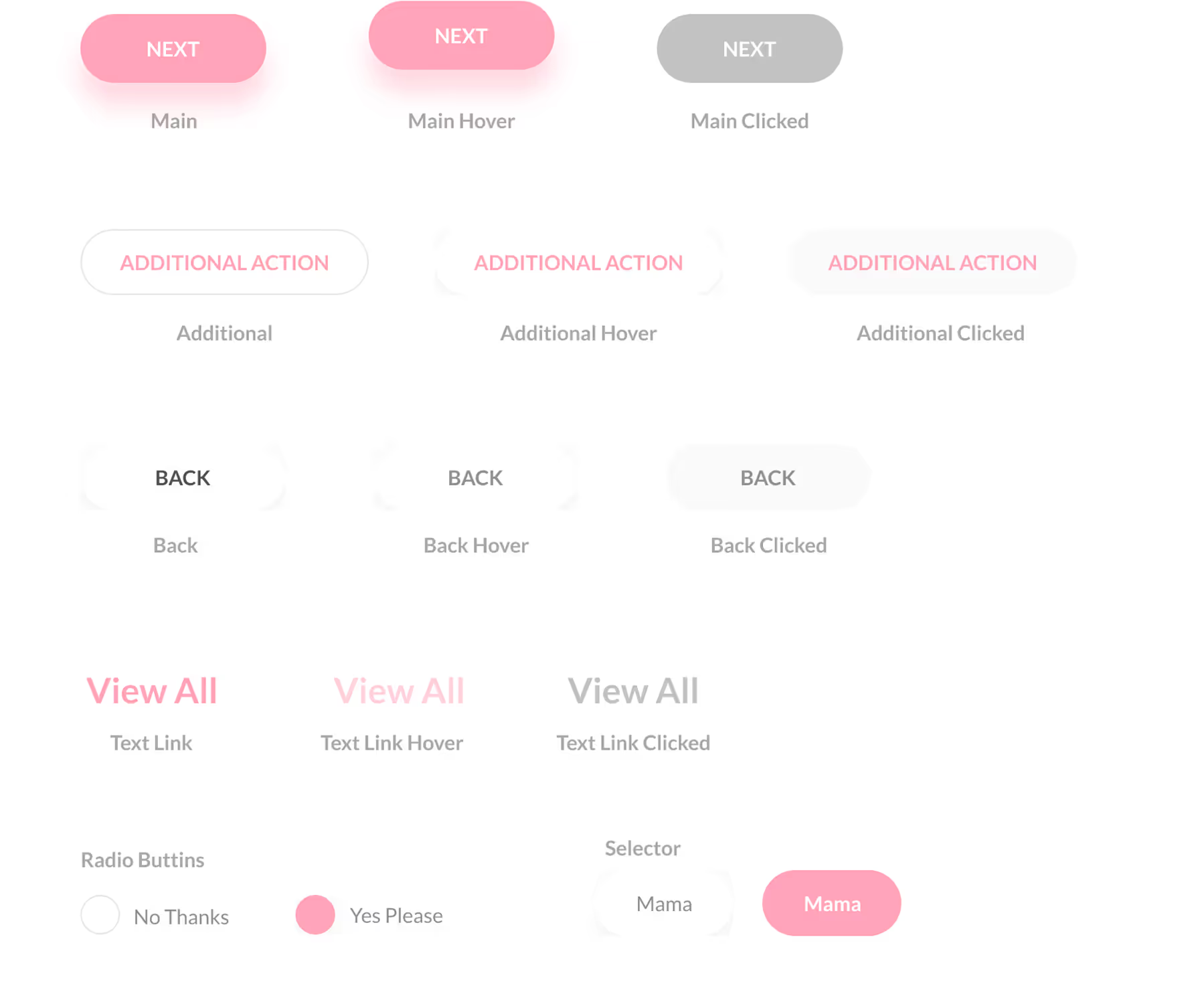
Buttons
Primary secondary tertiary and icon buttons with clear interaction states and accessibility contrast.
Icons
A curated set of intuitive icons optimized for clarity at various sizes with consistent stroke and spacing rules.
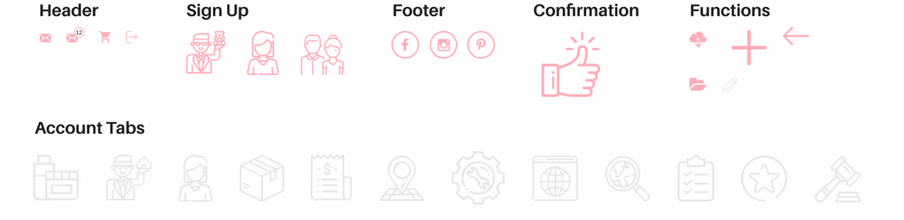
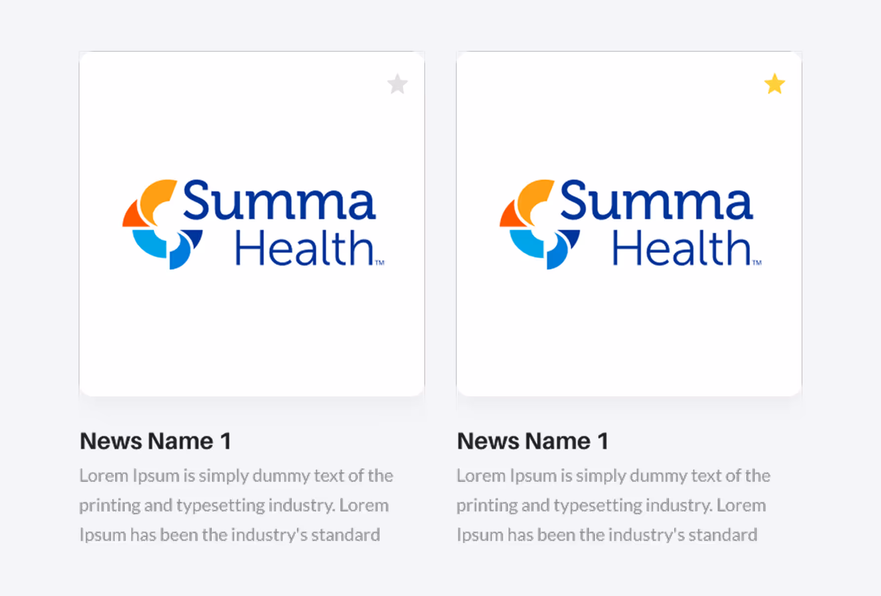
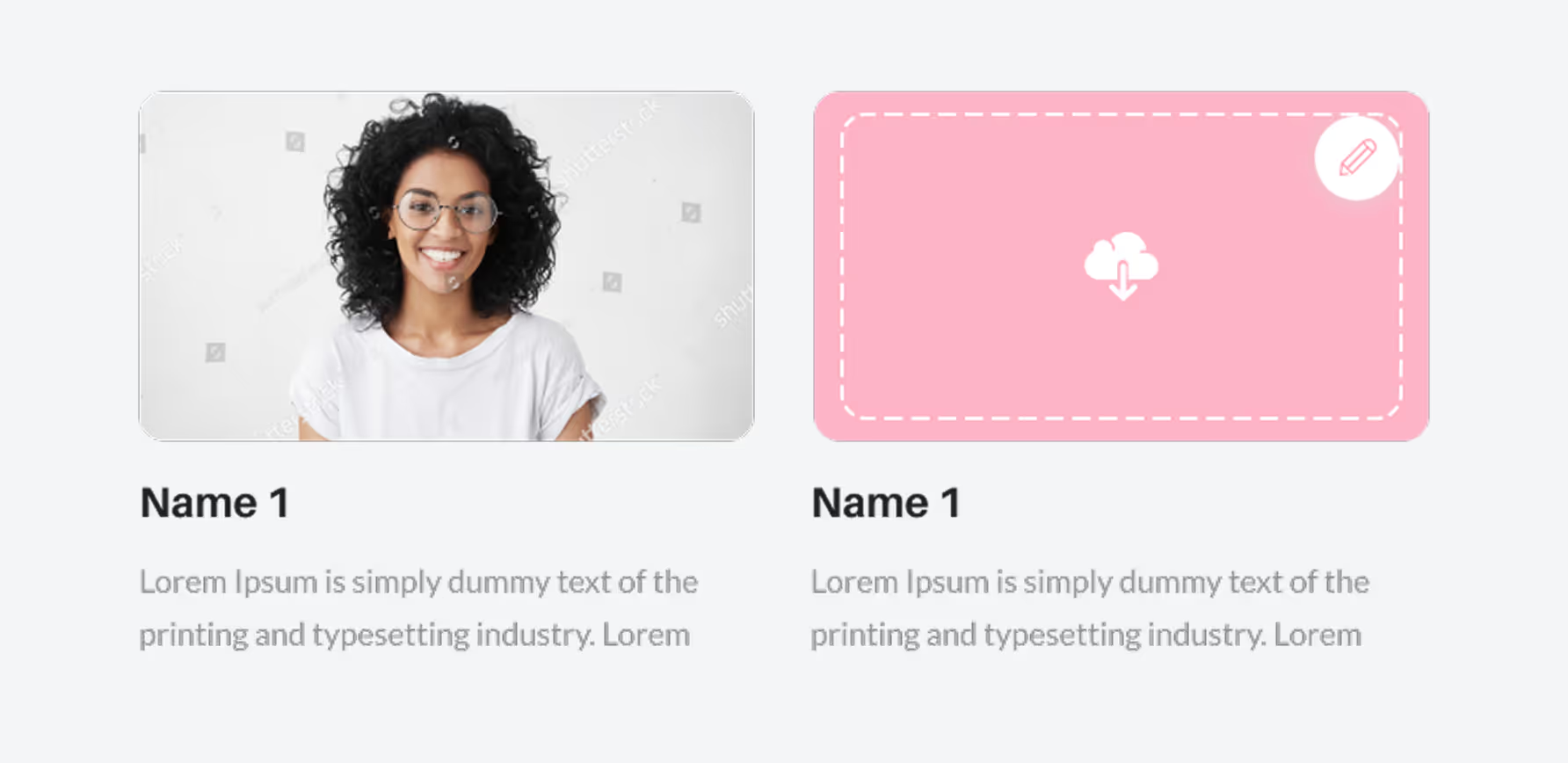
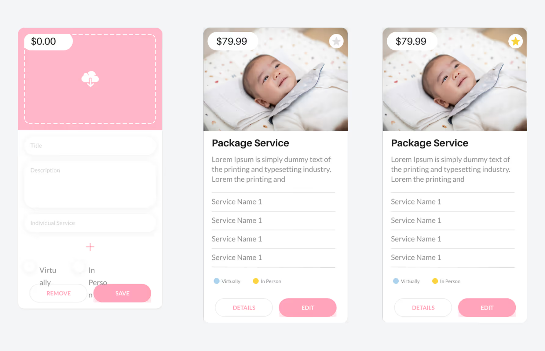
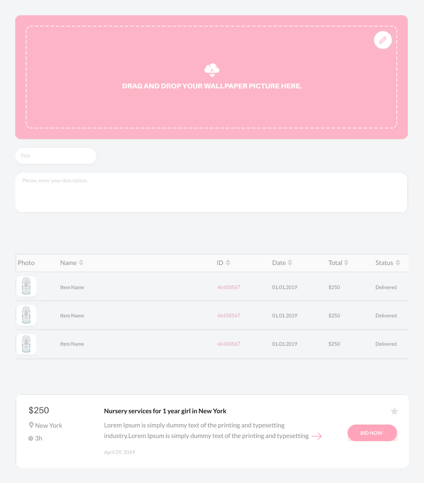
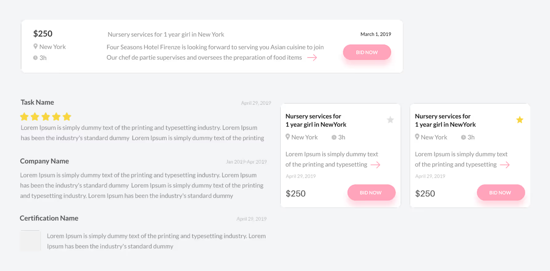
Cards
A wide range of cards tailored for different use cases.
Shop Cards
Team Cards
Individual Service Cards
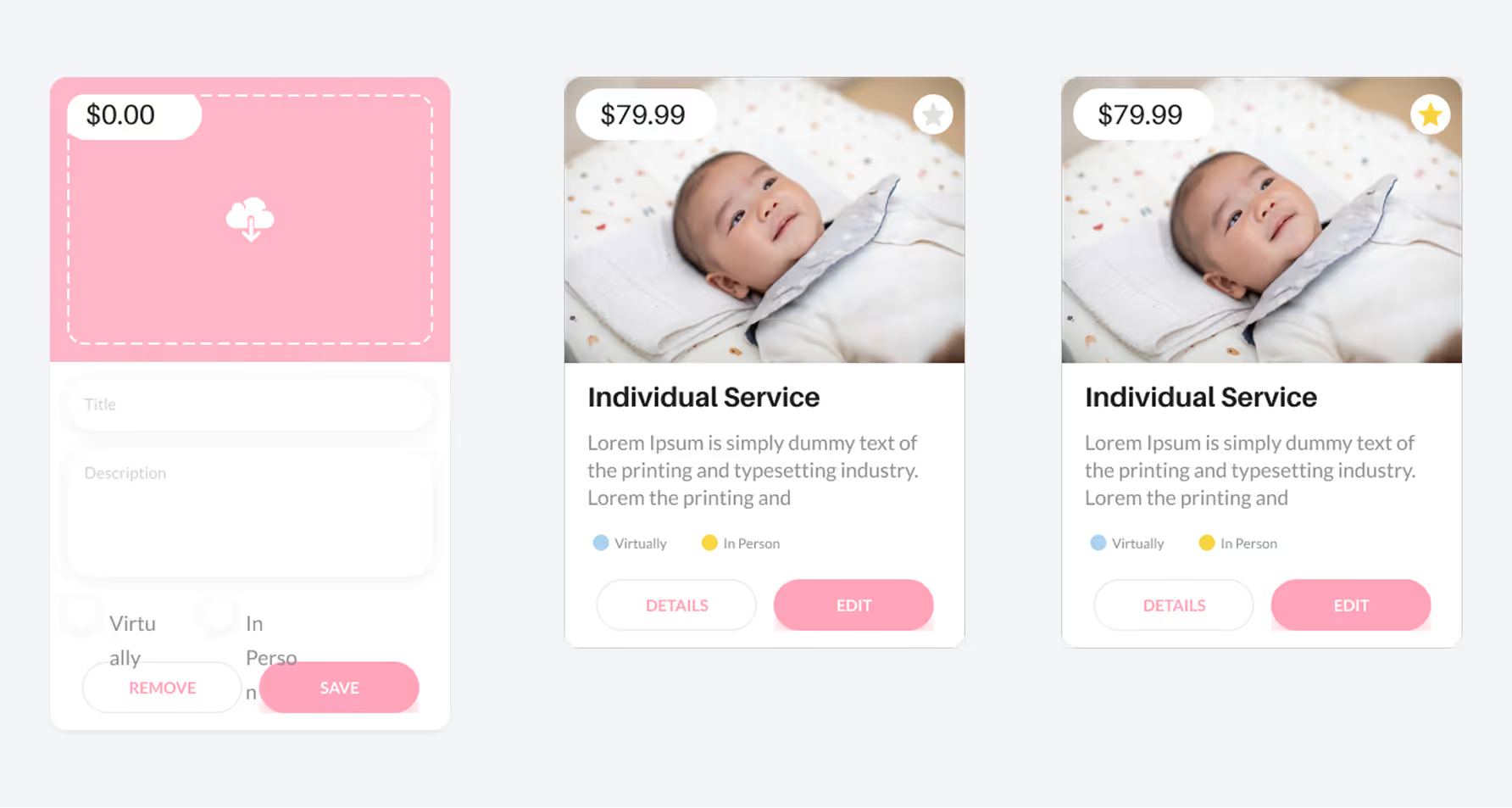
Package Service Cards
General Cards
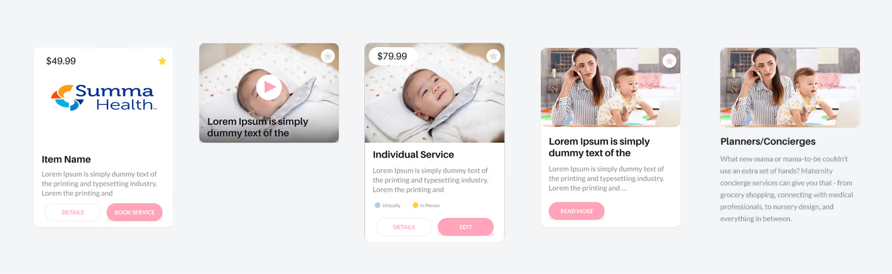
Other Cards

Product Cards
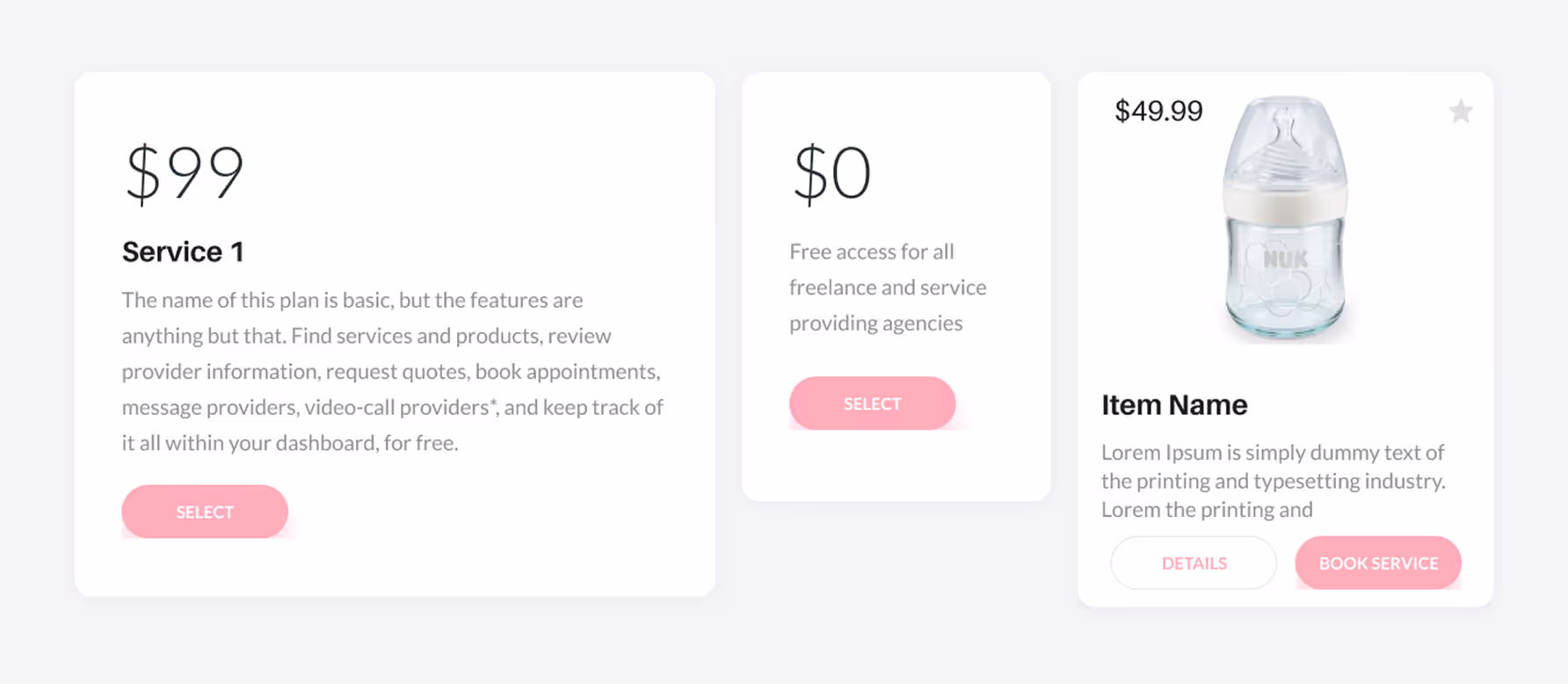
Testimonial & Pop-Up

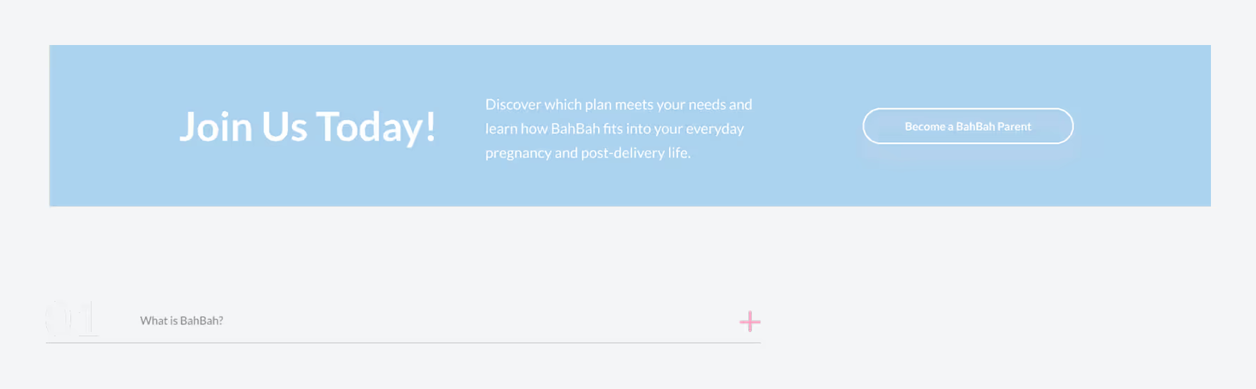
Full Cards
CTA & FAQ
vMomager
This comprehensive set of components accelerates development improves design consistency and supports a seamless user experience across the platform.
Once the foundations and components were complete I worked closely with developers and product teams to implement the design system across the FamHub platform.
The system was integrated into both the user-facing experience and internal dashboards ensuring visual consistency and reducing the time needed to build and scale new features.
The design system was rolled out across key areas of the platform ensuring consistent UI faster development and better alignment between design and code It now supports the dashboard admin panel shop and vMomager with reusable components and responsive layouts in place.
Explore the complete FamHub design system including responsive layouts reusable components and smart UI patterns built for family-focused platforms.
Dive into cards dashboards filters and admin tools all available in the original Figma file ready for developer handoff and team scaling.
Creating a shared design language helped align cross-functional teams and reduced redundant work.
Reusing components improved speed and ensured a unified experience across all touchpoints.
Introducing tokens for color, spacing, and typography created a clear bridge between design and code.
This minimized handoff friction and made collaboration smoother and more scalable.
Auditing the actual product revealed the most urgent needs including layout issues and card inconsistencies.
Designing with live use cases in mind ensured the system was both practical and future-ready.
To keep the design system evolving and aligned with product growth the following next steps are planned.
Introduce additional complex components such as tables charts and dynamic forms to support upcoming product features.
Continue improving accessibility by testing components against WCAG guidelines and enhancing keyboard and screen reader compatibility.
Optimize mobile-specific components and interactions for smaller screens and touch-based navigation.
Integrate tools to streamline documentation updates and keep component usage guidelines in sync with design changes.
Book a free 30-minute discovery call
Tell me what you're building.
I'll tell you how I can help and exactly what it will cost.
Currently taking new clients · Typical start: 1–2 weeks from contract